project overview
Project
Elan - a multi-brand cosmetics retailer
in the Middle East
goal
To develop a brand identity for a new cosmetics store
that is recognizable and appealing to both men and
women, while feeling authentic to Dubai's cultural
context
Solution
We created a fresh, contemporary brand identity that
reflects gender neutrality and key attributes of Dubai.
We focused on striking a balance between elegance
and accessibility, making the brand relatable and
relevant to people across the Middle East

How we did it
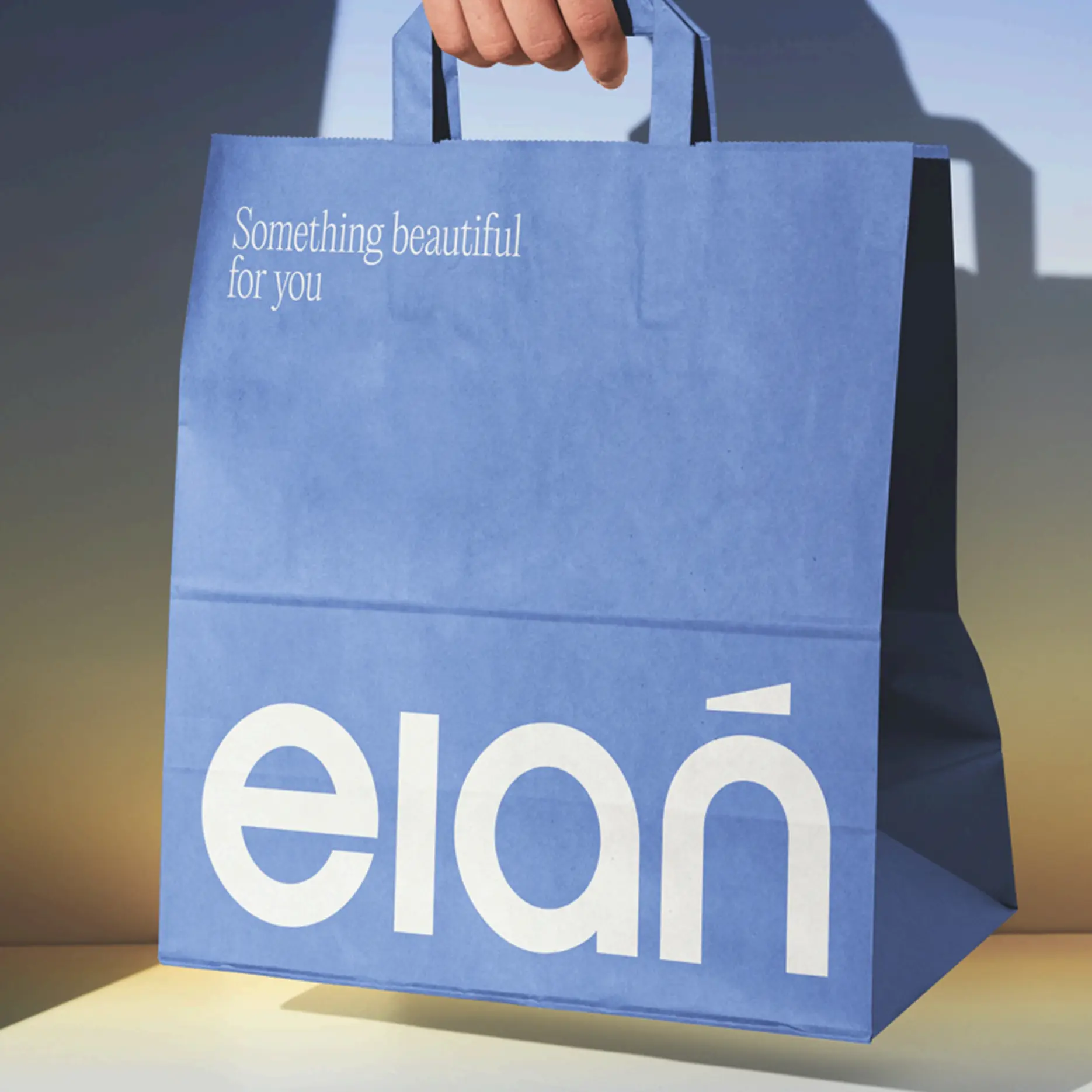
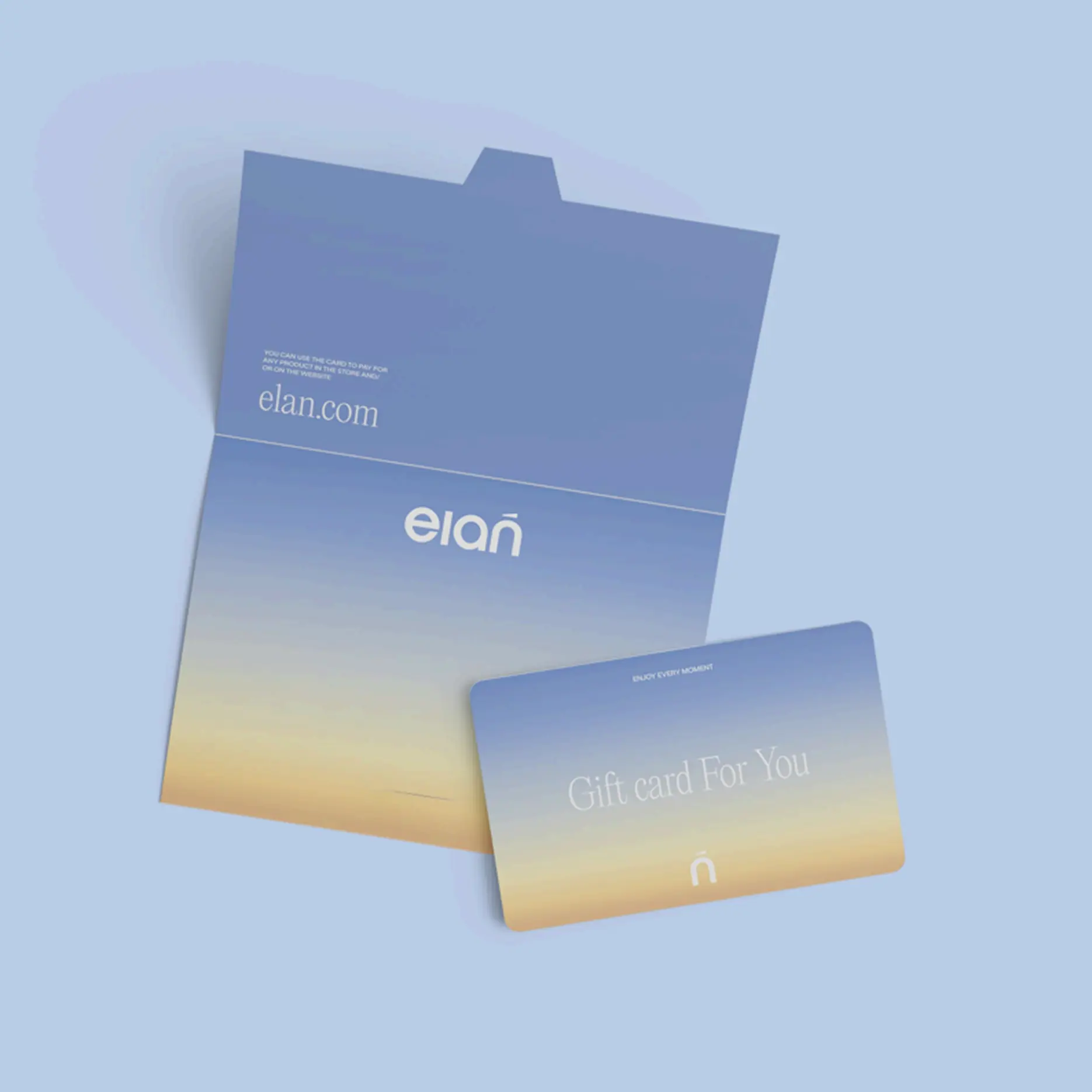
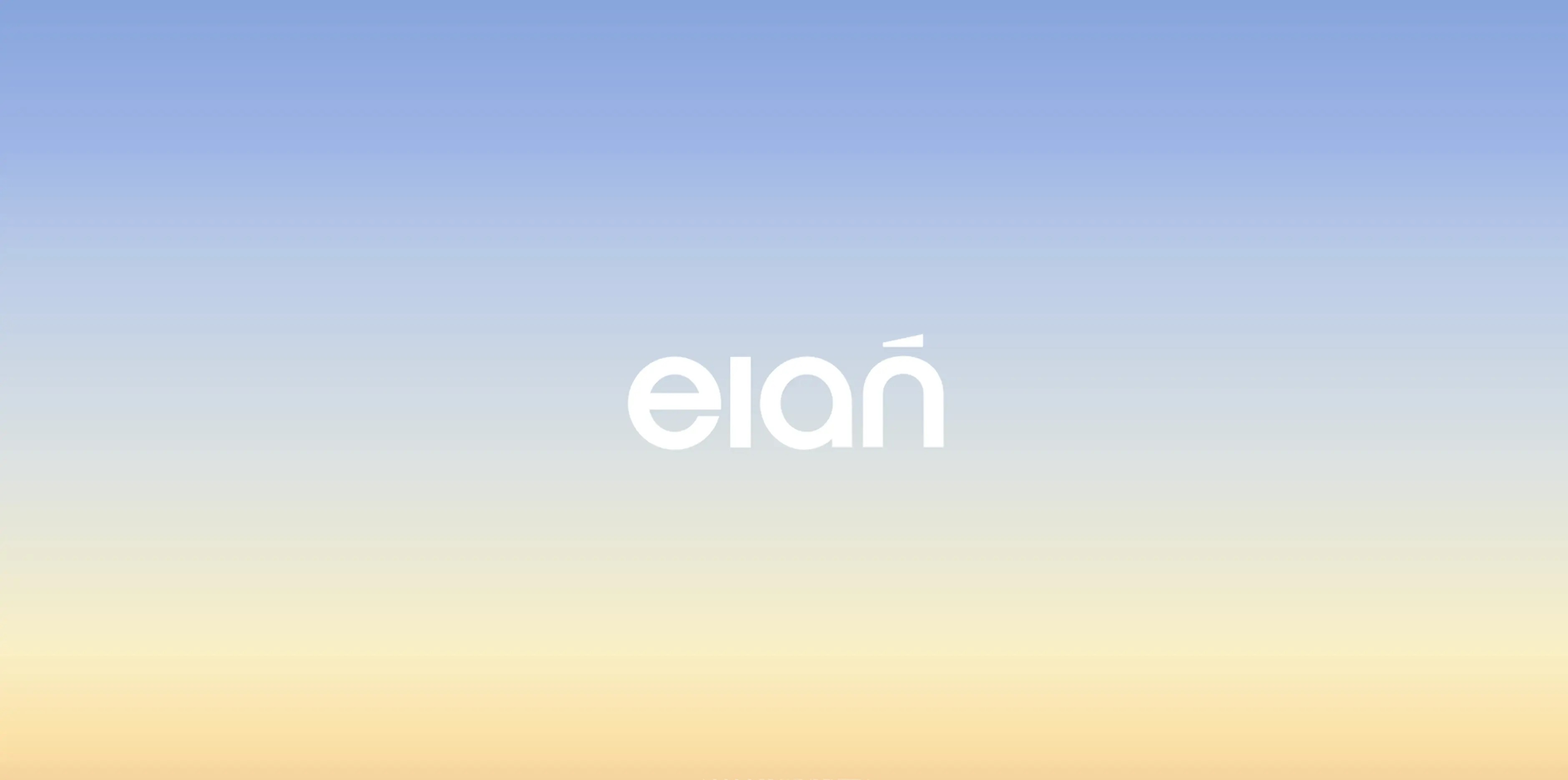
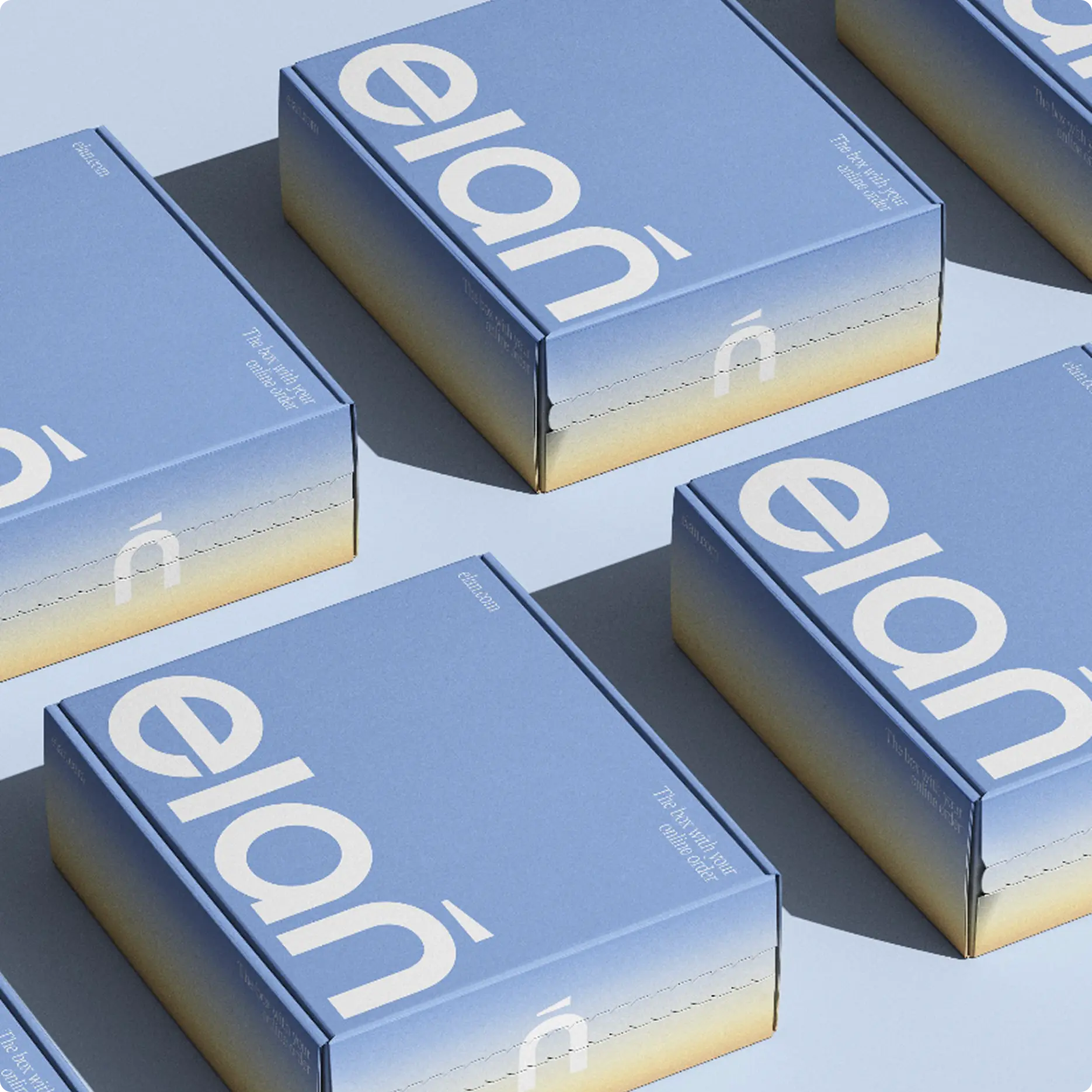
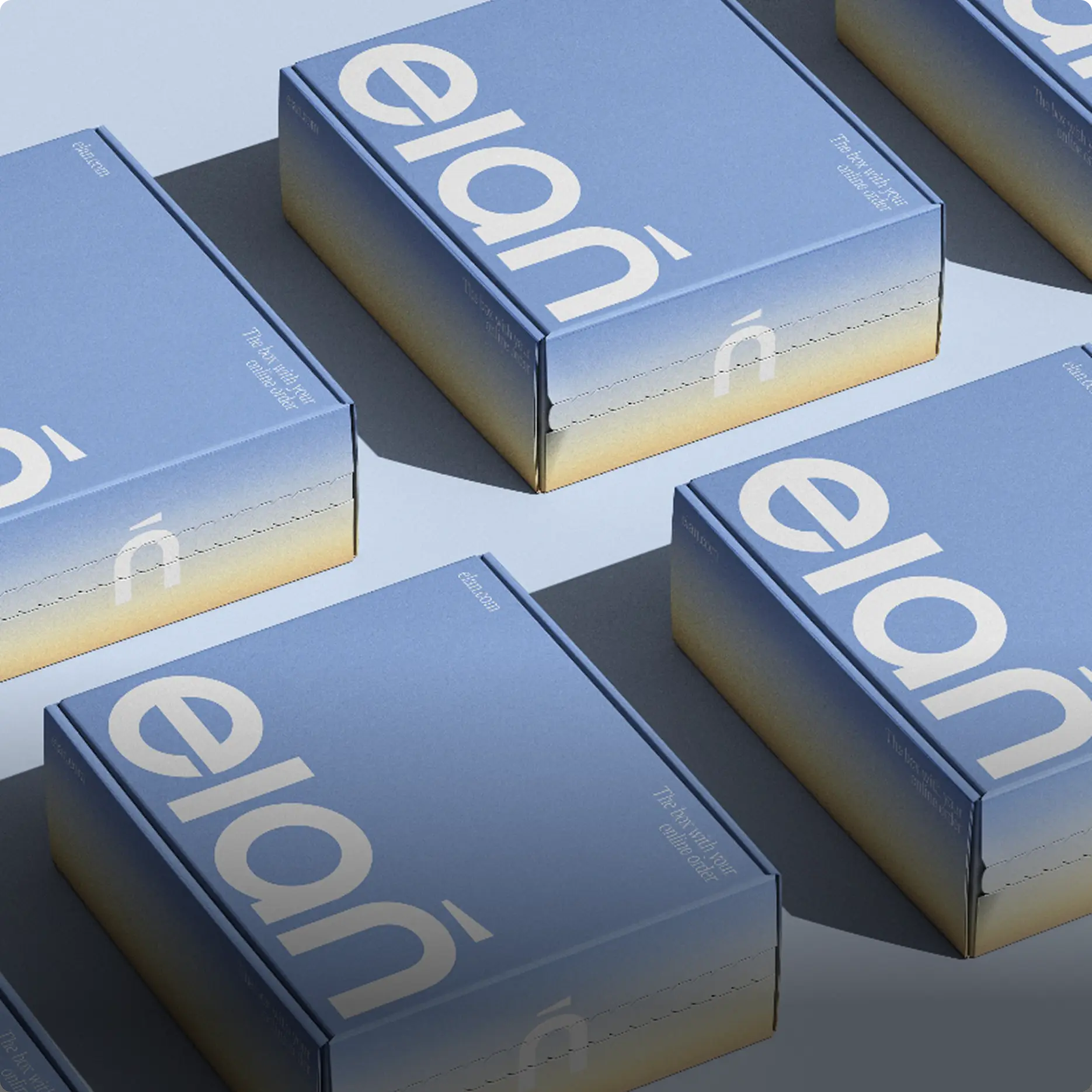
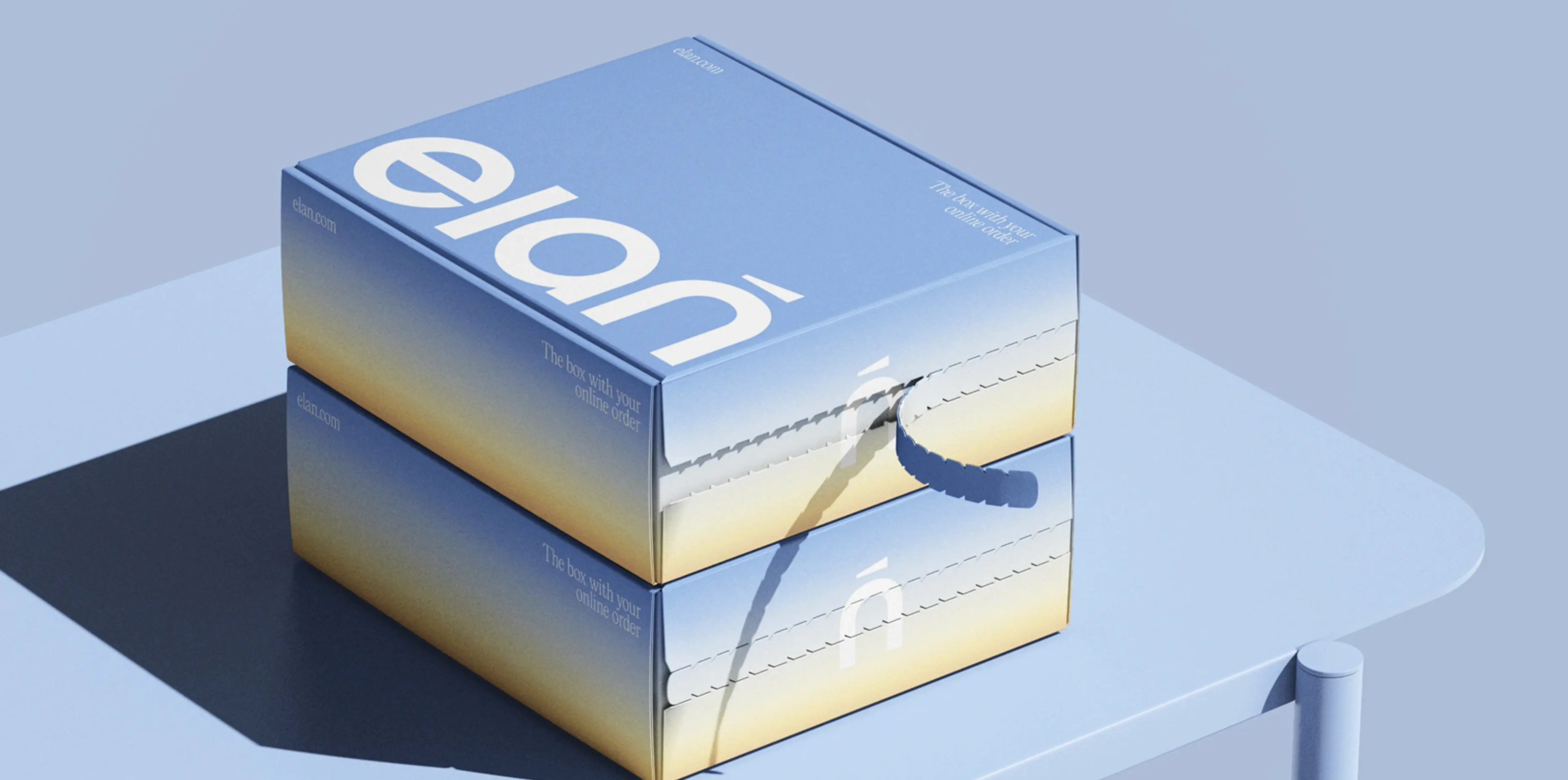
We built the visual foundation on two colors: blue like the sky and yellow
like the sun
Blue represents purity and trust; yellow conveys energy, life, and joy. These
shades are associated with the sky, water, sun, and gold—powerful symbols
of strength, spirituality, and abundance in the region
Together, they create a harmonious appeal for all genders. The gradients,
blending the two shades, symbolize the fusion of two worlds: skincare
and makeup
Challenges we faced
how we did it
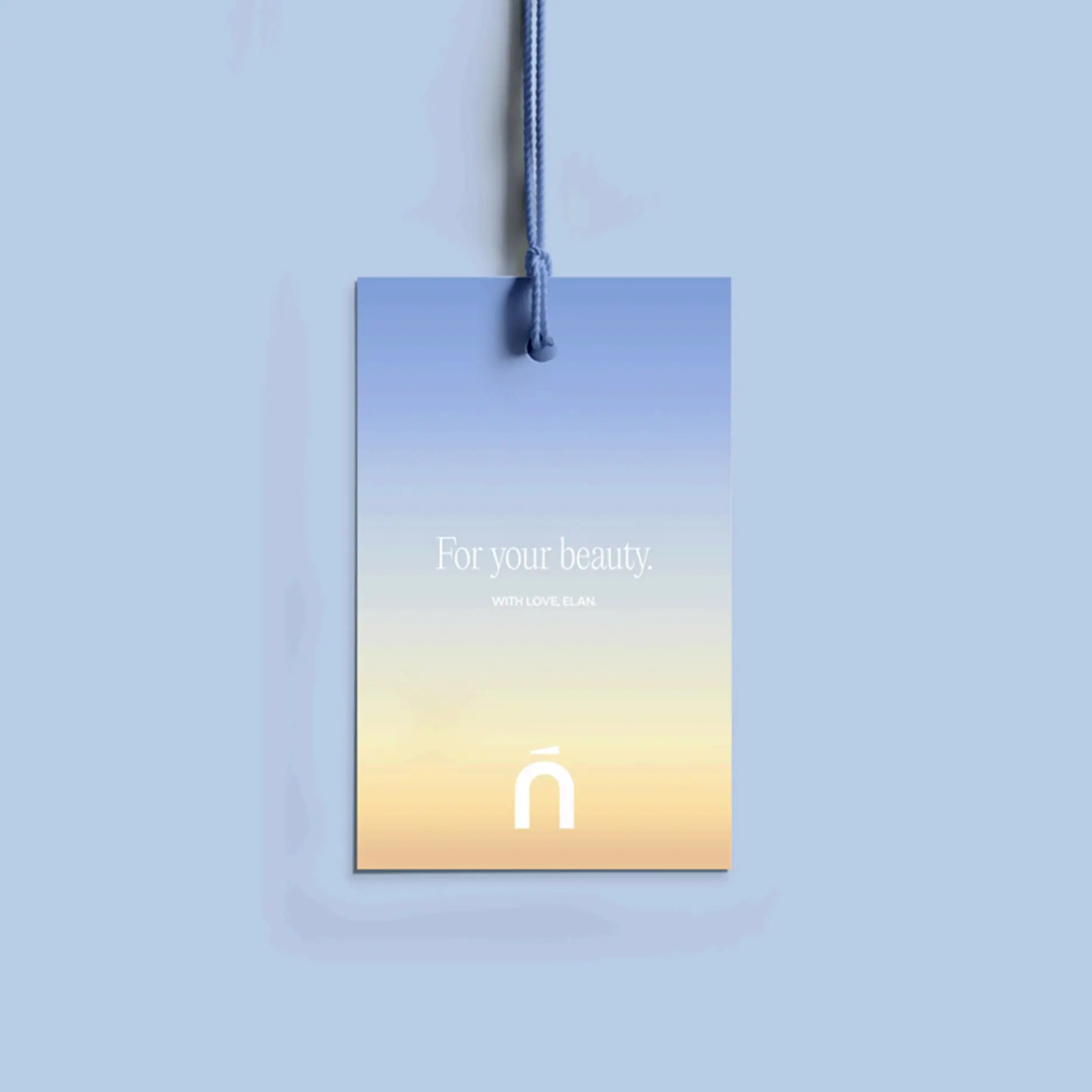
We selected minimalist yet distinctive typography: rounded forms make the
brand feel friendly, while clean geometry adds a touch of rigor and hints
at the expertise of a brand founded by doctors and skincare specialists
We built the graphic system to perform confidently across both digital
and physical touchpoints
Challenges we faced
how we solved it

Tight deadline: We had just2 weeksto design the entire identity from
the ground up. We delivered!
We also had to navigate diverse cultural expectations, which we achieved
by implementing gender-universal visual solutions
Results
Elan received a bright, open, and accessible beauty
retail brand.
It is equally comfortable for men and women, feels like
a natural fit within Dubai's cultural code, and
masterfully balances premium quality with
accessibility, and expertise with warmth.