
project overview
Project
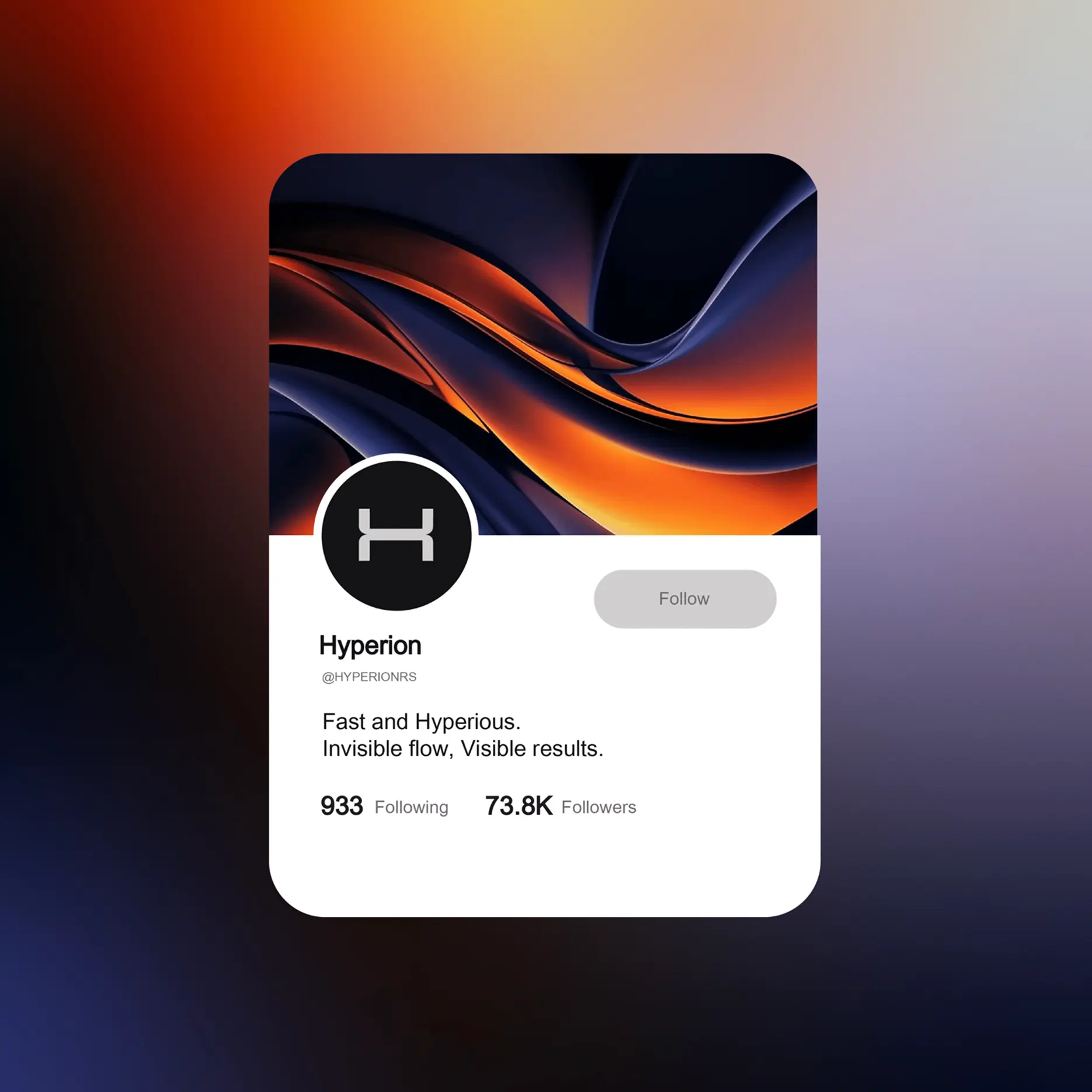
Hyperion — technology product for seamless payment
integrations. Its core strengths are deep expertise, rapid
implementation, and flexibility. The team has insider market
knowledge and delivers solutions tailored to each client
goal
To refresh the brand: make it modern, tech-driven, and
visually powerful — so that clients immediately perceive
the company's scale and expertise
Solution
We delivered a complete overhaul of the brand style, website,
and identity: logo, slogan, color palette, digital and offline
assets. The brand now looks as confident as its technology

How we did it


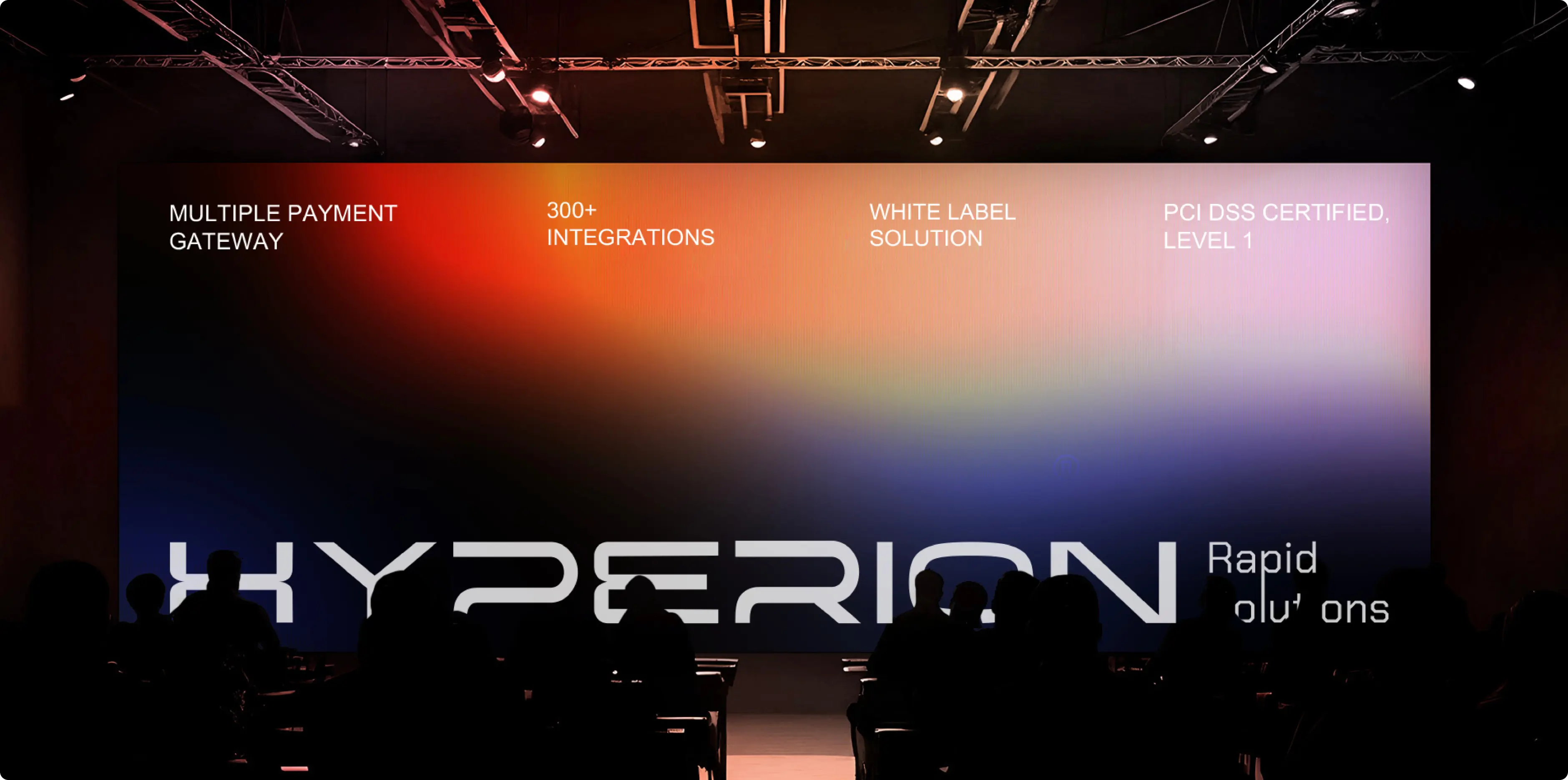
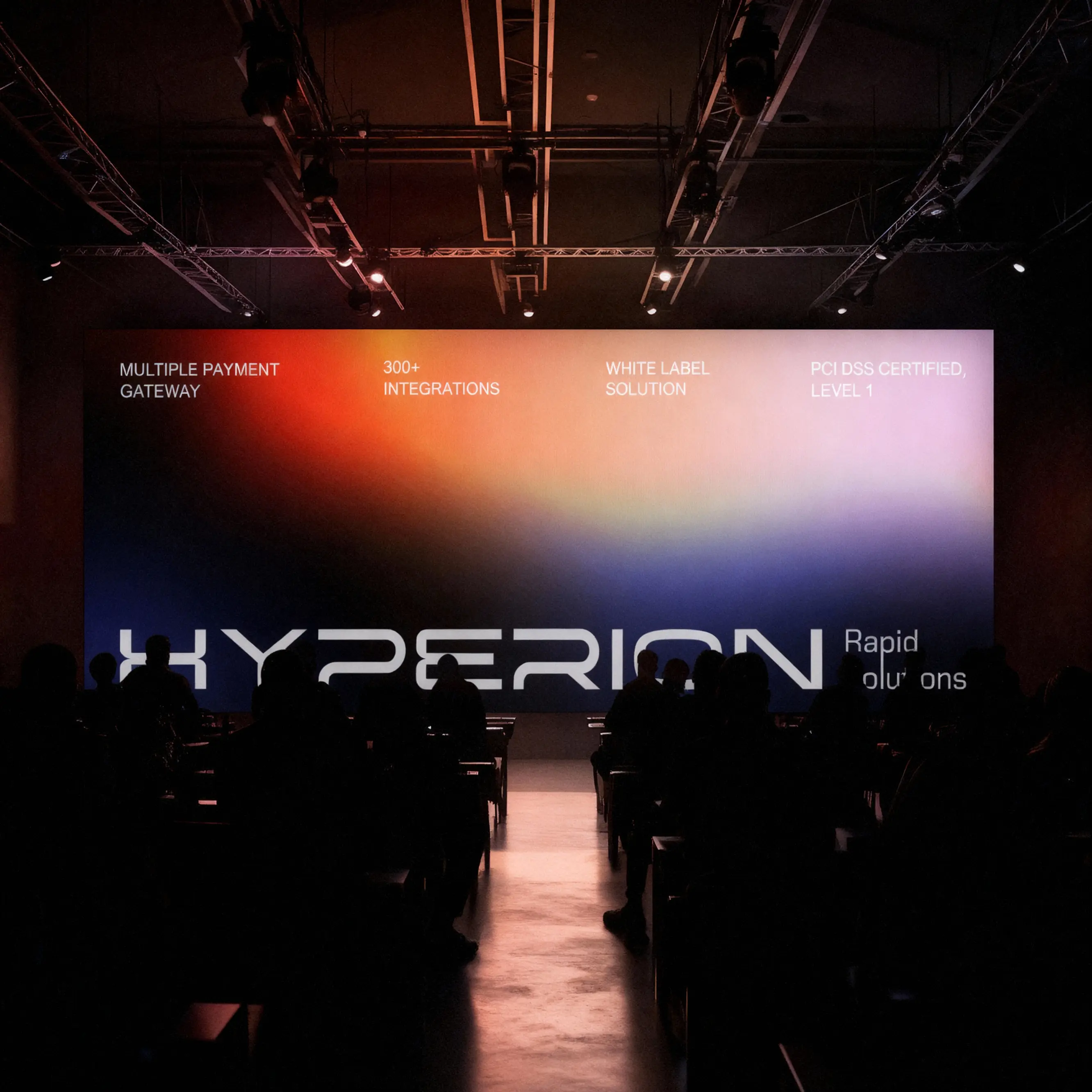
In the slogan Fast & Hyperious, we fused the core values of speed,
technological excellence, and transparency, drawing inspiration
from the name Hyperion—the ancient Greek god of light
This defined the brand's aesthetic: a sturdy, substantial typeface, a vibrant
gradient, and a sense of dynamism
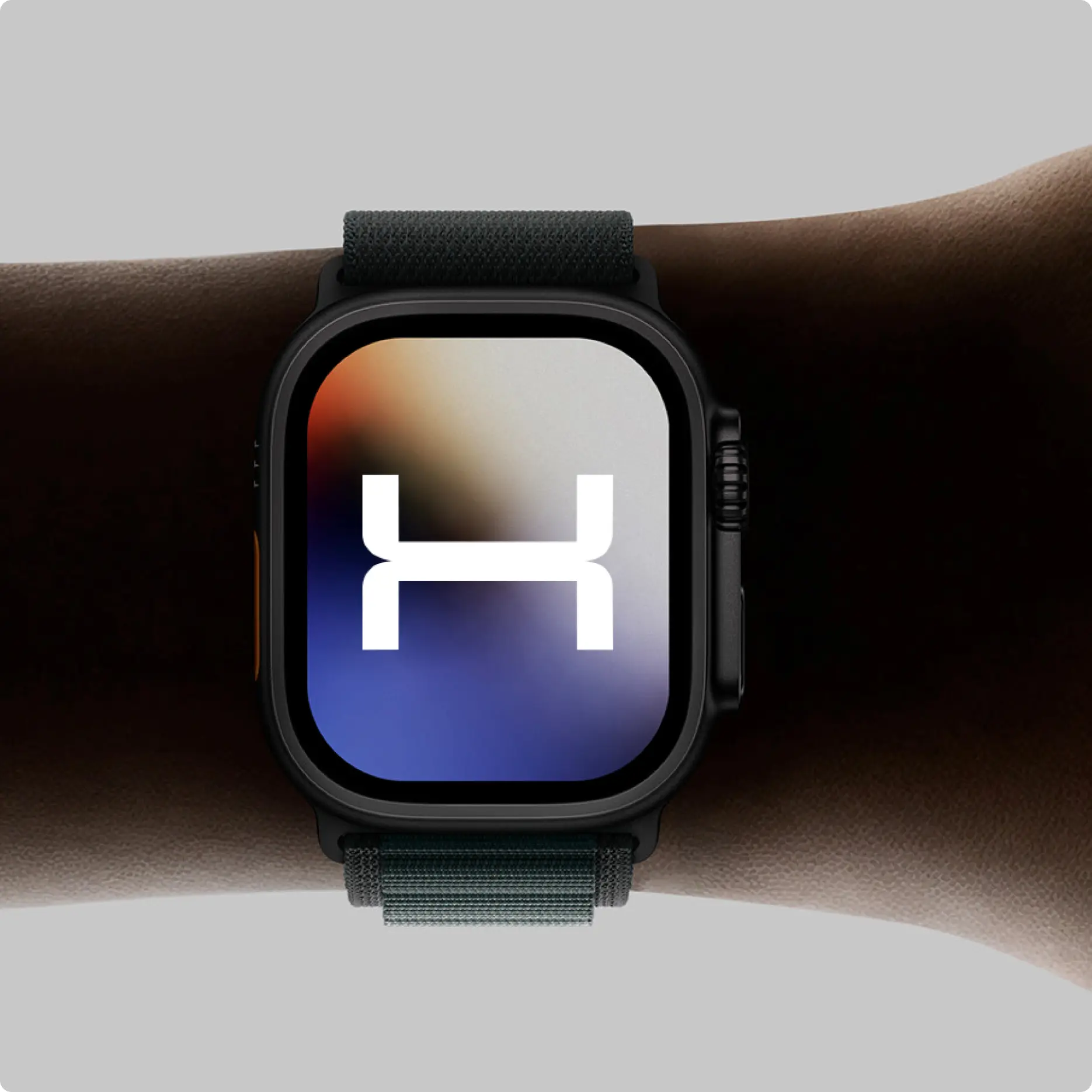
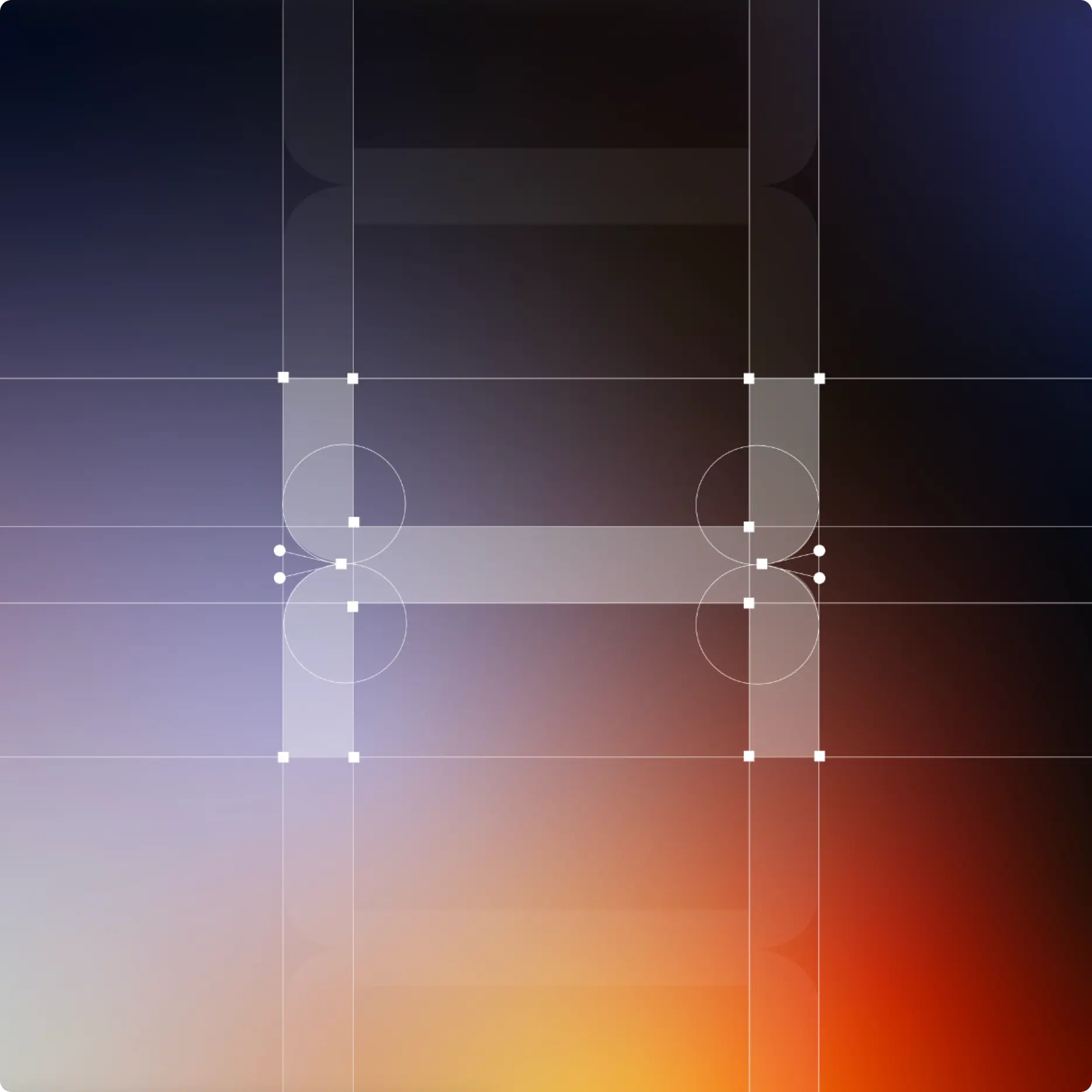
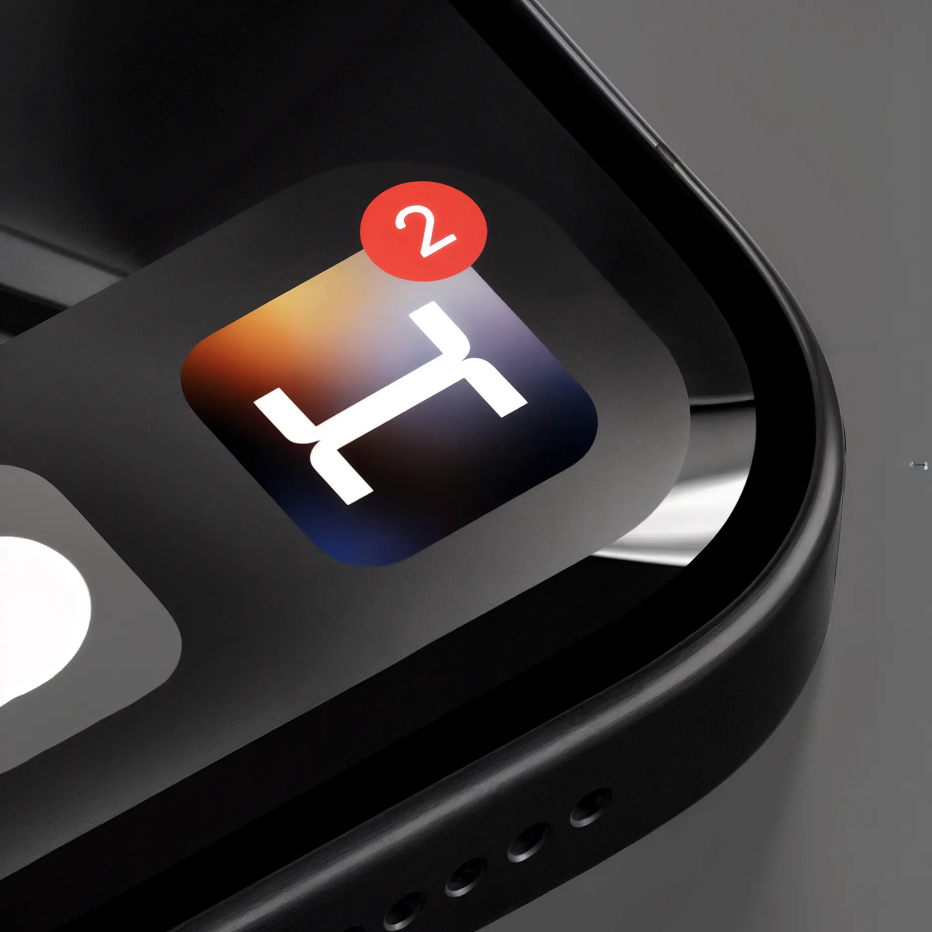
We built the logo around the letter "H"—a link in a chain, symbolizing payment
integrations
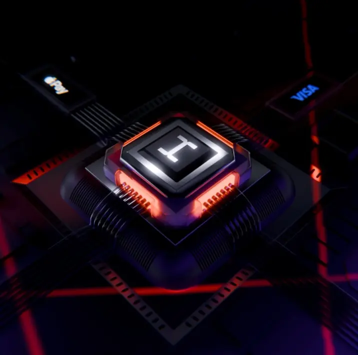
For the website, we created a 3D chip that visualizes the live mechanism
of a payment process, and we designed exhibition booths for conferences
worldwide
Challenges we faced

The task was not just to create a logo, but an entire, flexible brand ecosystem—from icons to exhibition stands. And not just to create it,but to perfectly meet the client's vision—often the greatest challengein branding. In this case, we nailed it on at the first attempt!
how we solved it
Results
relevant branding system where every element works as a partof a cohesive ecosystem
brand that stands out
satisfied client
.webp)