.webp)
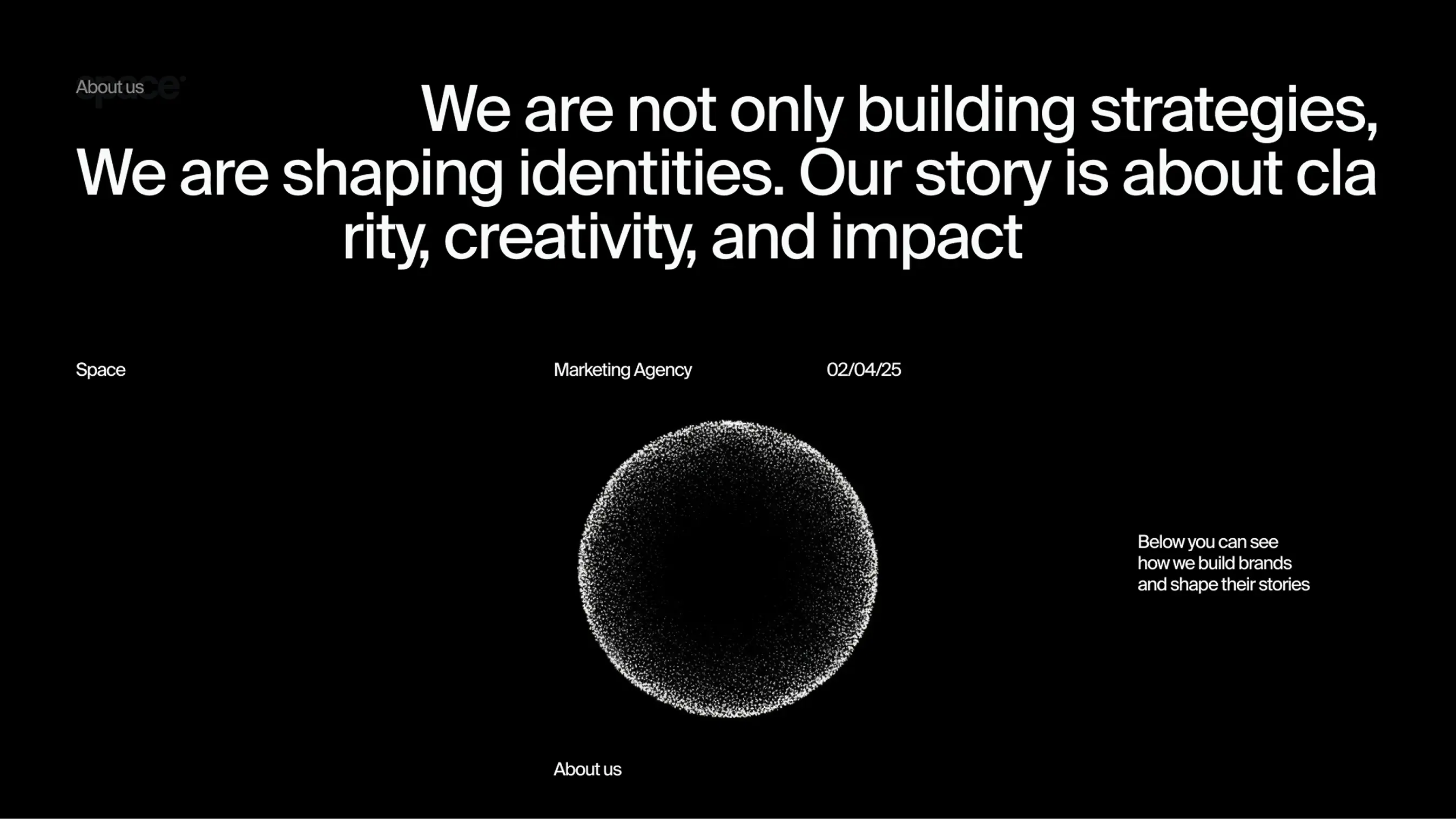
project overview
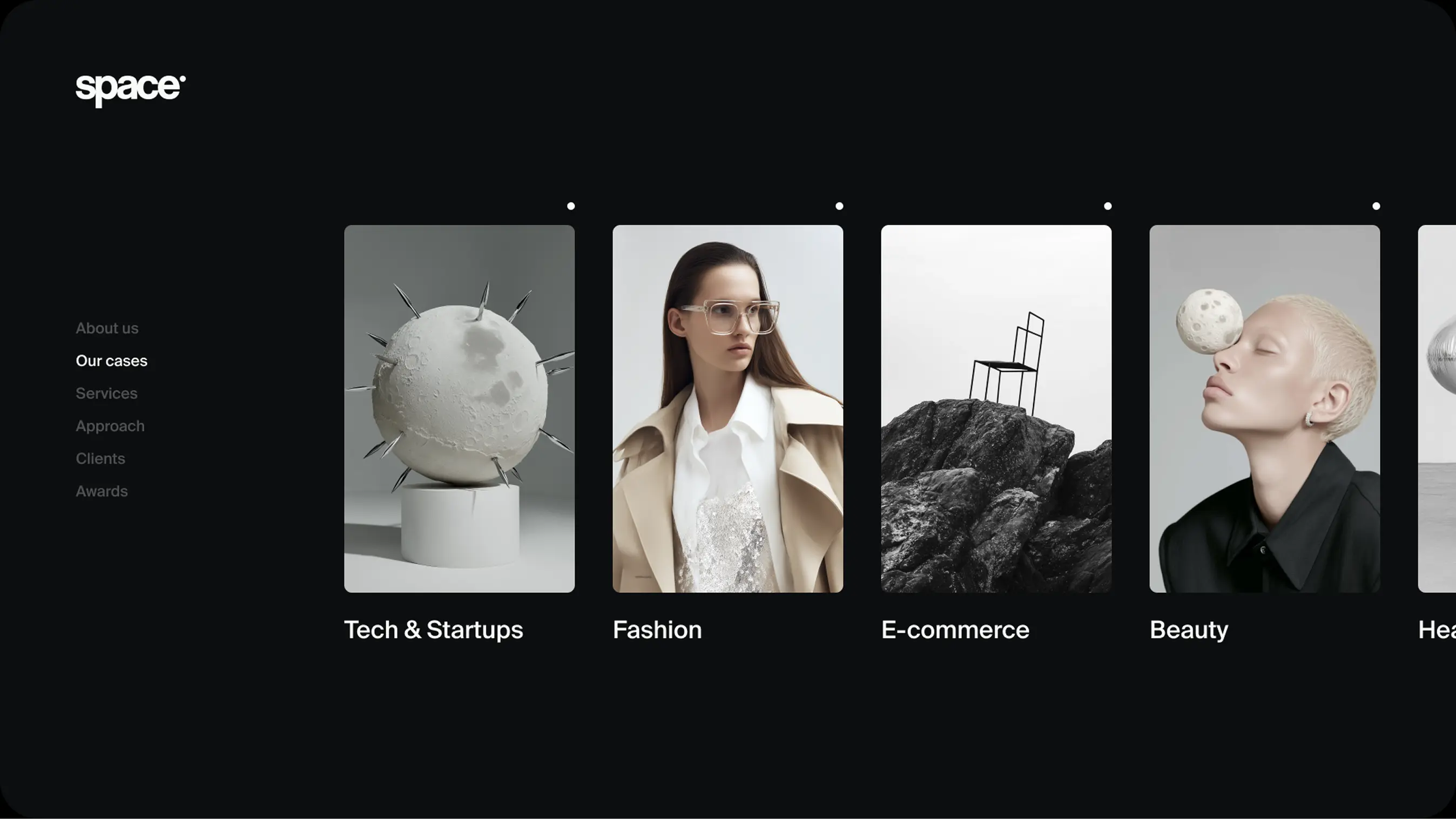
Project
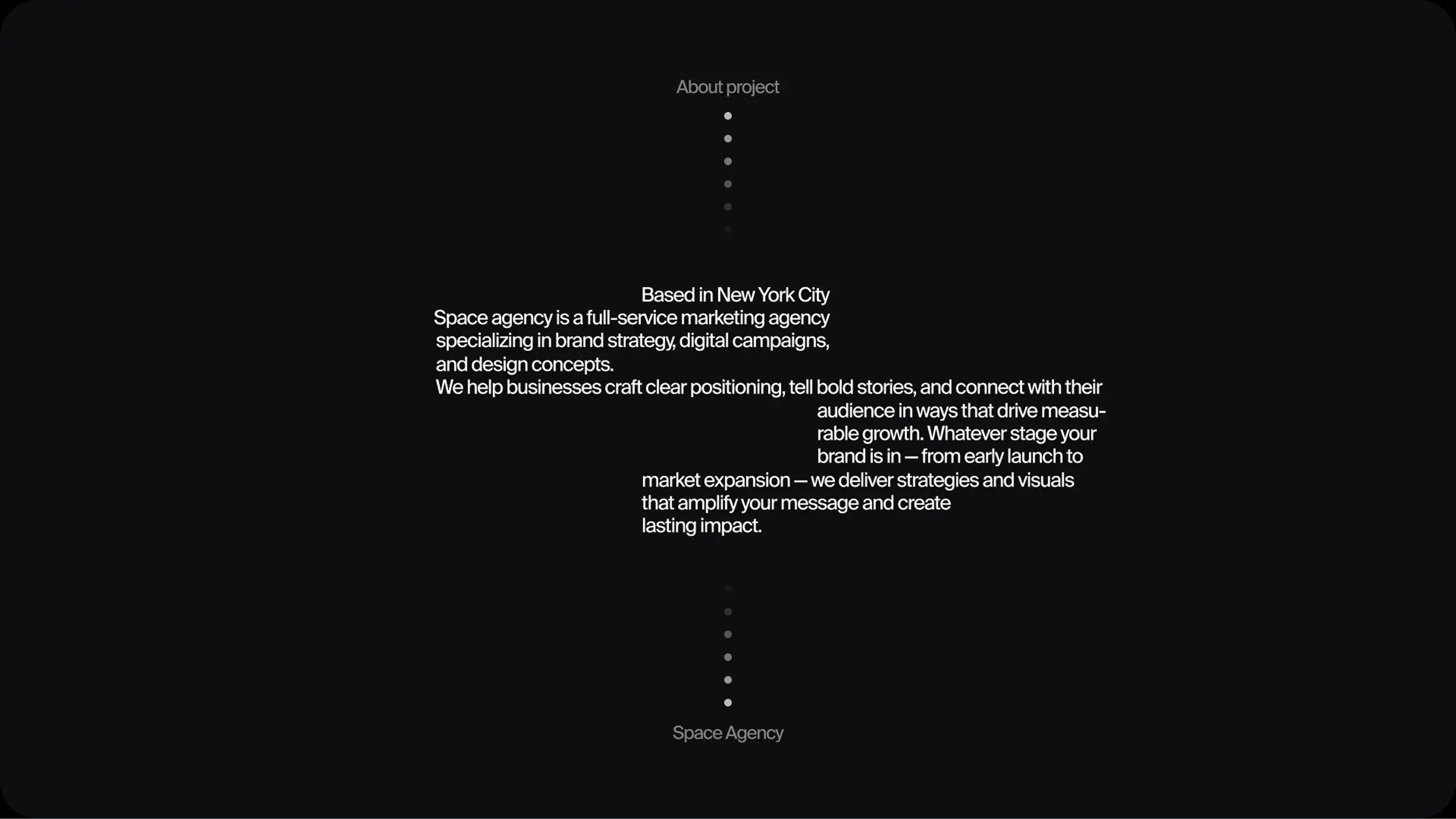
Space Consulting – consulting agency in a highly competitive
market
goal
To develop a distinct brand identity with its own unique
DNA that would help the agency stand out among dozens
of long-established competitors
Solution

How we did it
Solution


The concept is rooted in the ideas of space, motion, and new beginnings.
We expressed this not literally, but through subtle details: geometry,
textures, and forms
The logo is minimalist: a clean typeface and a dot that became a symbol
of the brand's focus and energy
We used a black-and-white color palette with accents of grey and silver.
It creates a sense of premium quality and technological edge without being
overly cold
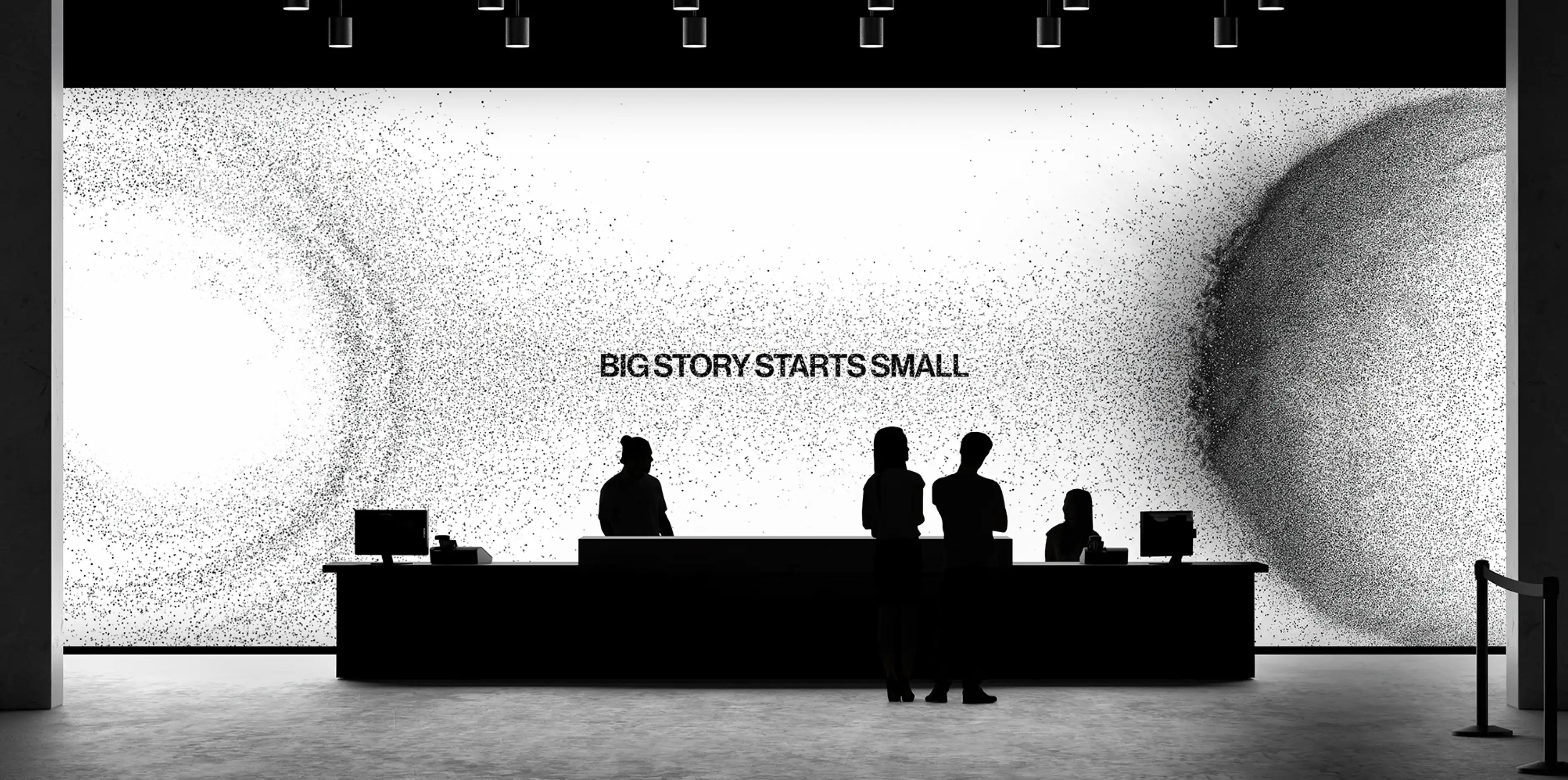
We introduced "stardust" textures and abstract orbits as part of the visual
language, carefully avoiding an overload of obvious "space" symbolism
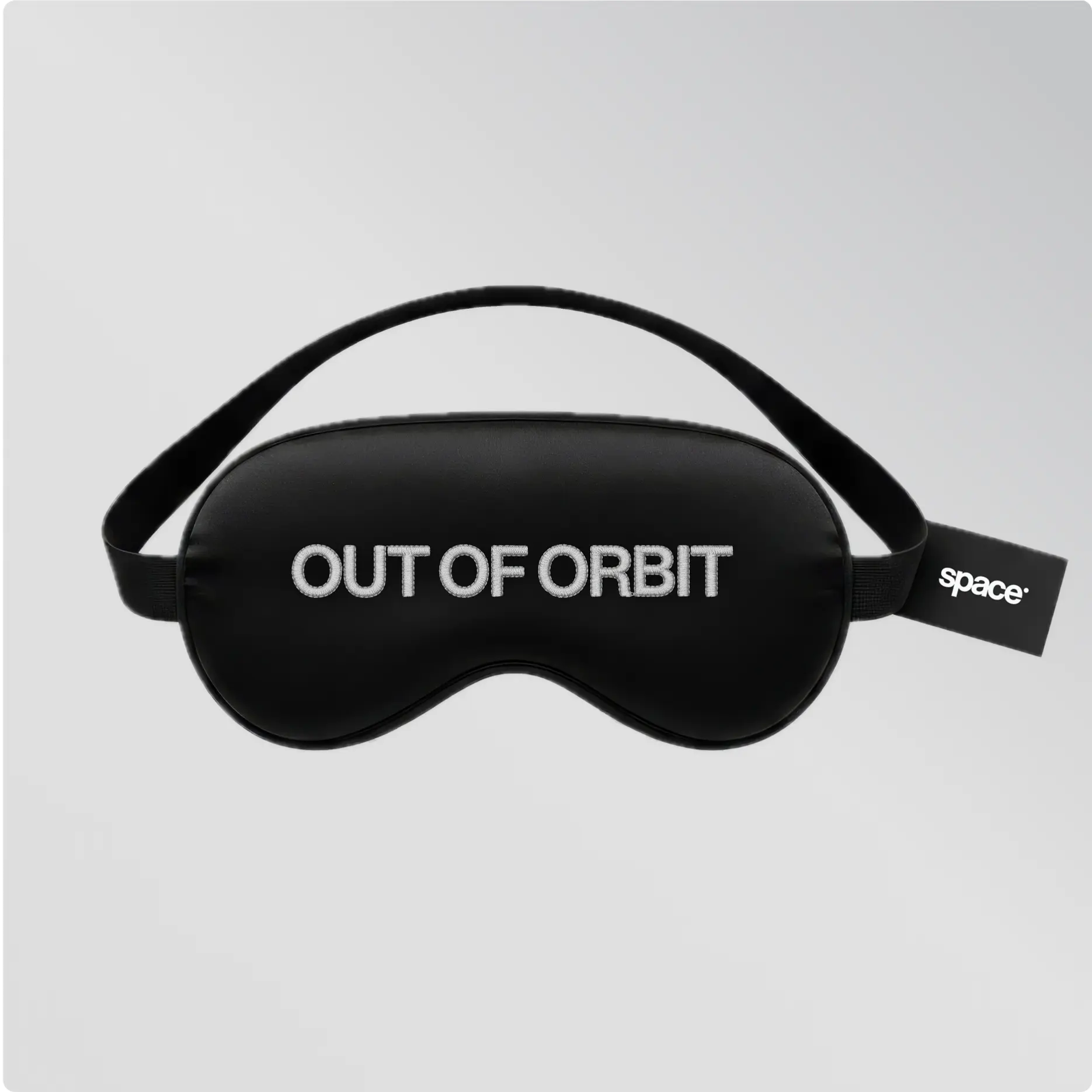
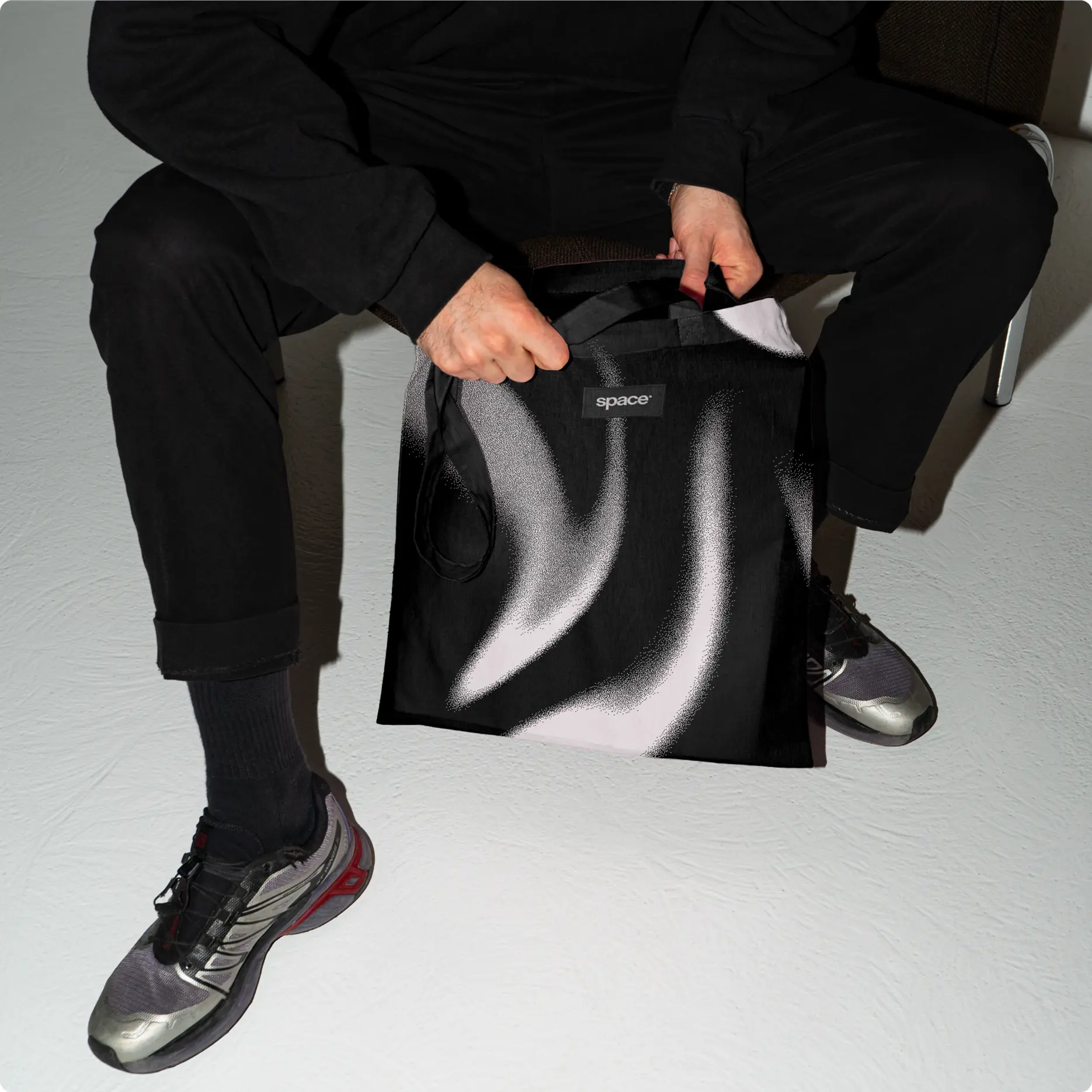
Additionally, we developed merchandise and brand assets—from business
cards and hoodies to travel kits and digital materials—ensuring brand
recognition at every touchpoint
Challenges we faced

To create a strong, distinctive style in a crowded niche
while avoiding direct associations with astronomy
To design a visual language that would remain striking
and recognizable across both digital and print media
how we solved it

We transformed the brand's dot into a standalone graphic
element that works with equal confidence in both digital
and offline formats
We conveyed "space" not literally, but through geometry, light,
and minimalism. Popular "space" elements like stardust and
cosmic textures were intentionally used only as subtle
accents


Results
The agency has now established its own visual orbit—a style
that is instantly recognizable and memorable, distinguishing
the brand in the market and perfectly reflecting the company's
values and philosophy