project overview
Project
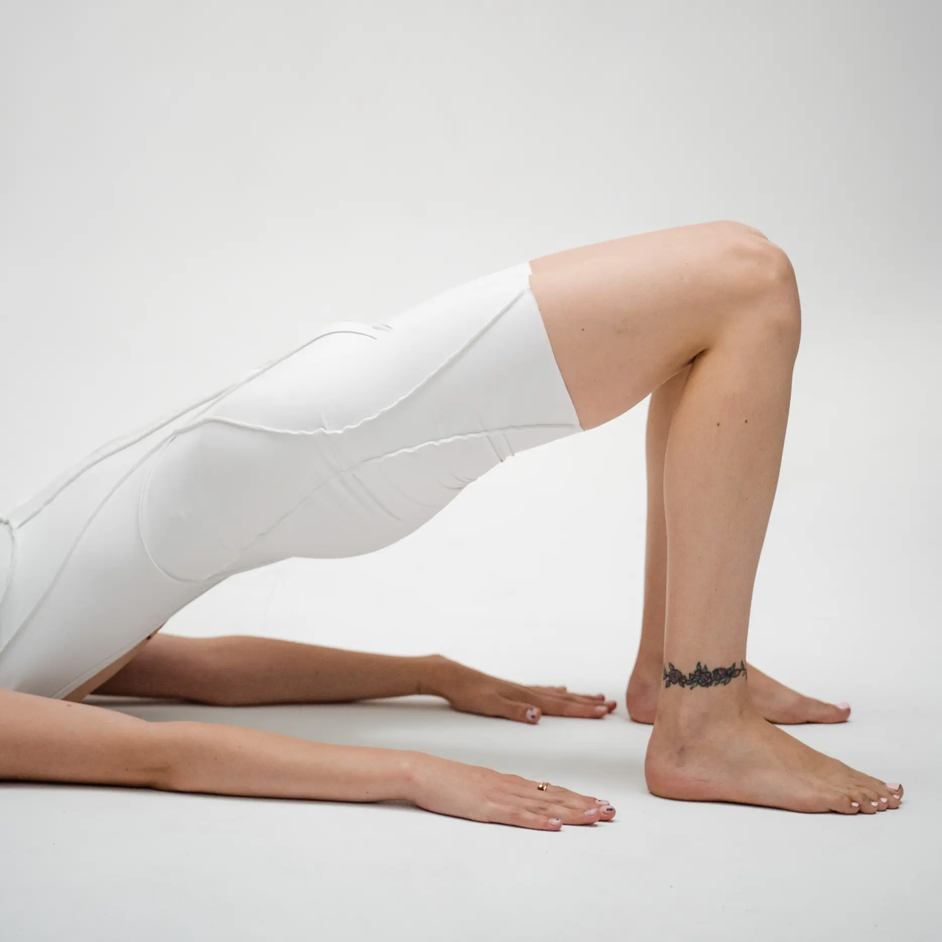
A new soft sports studio (yoga, pilates, barre)
in Valencia, designed to unite women through
workouts, socializing, and creative gatherings
goal
To help the studio build a positioning distinct from
the typical "zen/neutral" yoga aesthetic and attract
a younger audience
Solution
We developed a naming and brand identity that differentiates
the studio through its unique aesthetic and values,
presenting it as a lifestyle hub and a community space

How we did it
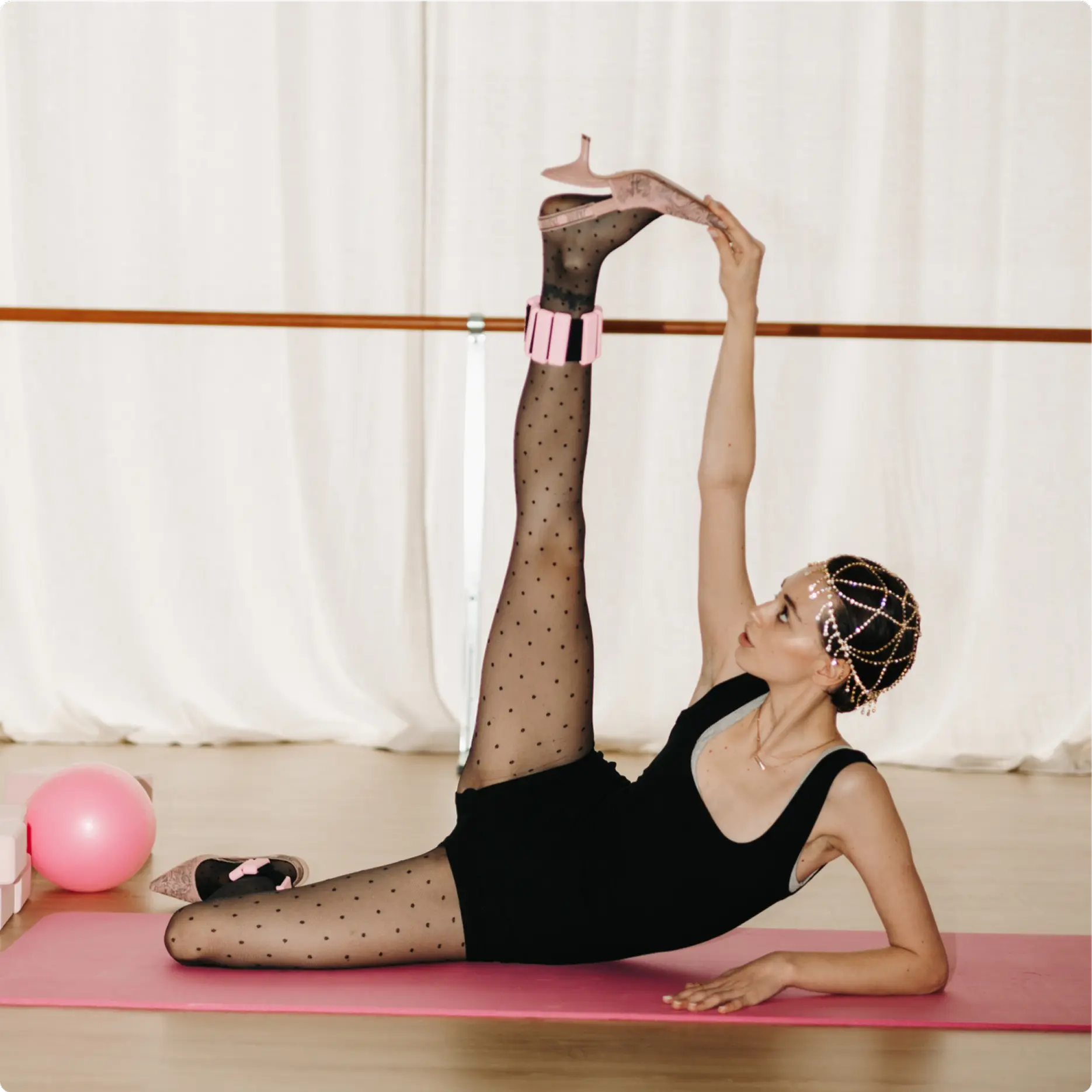
We built the Stoodie identity around the core idea of"Sport / Friends / You"—
positioning yoga and pilates as part of a modern lifestyle. It's not just
a workout; it's about community, friendship, and self-care
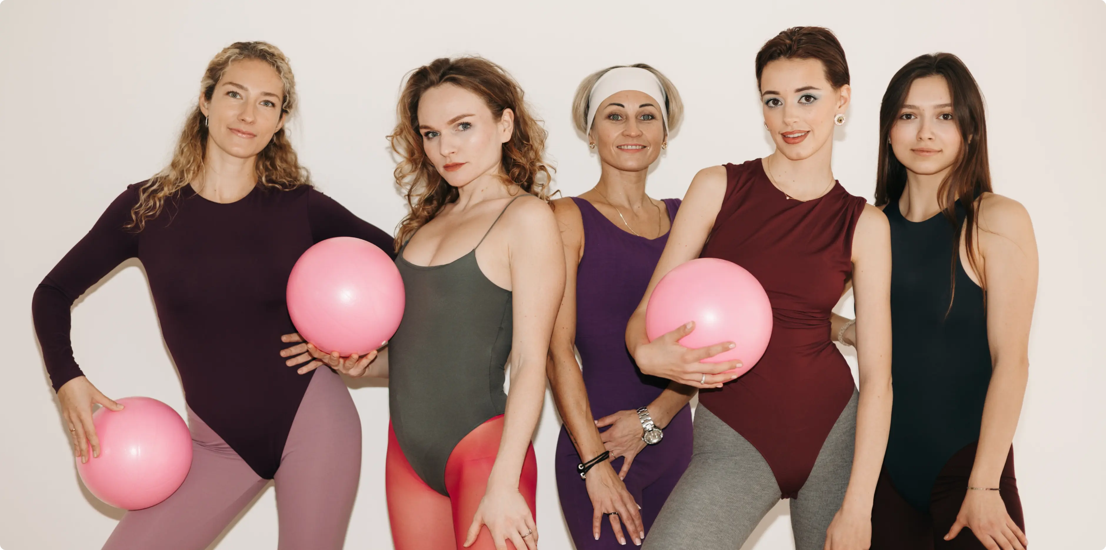
We balanced the visual language to convey lightness, boldness, femininity,
and a fashion-forward style
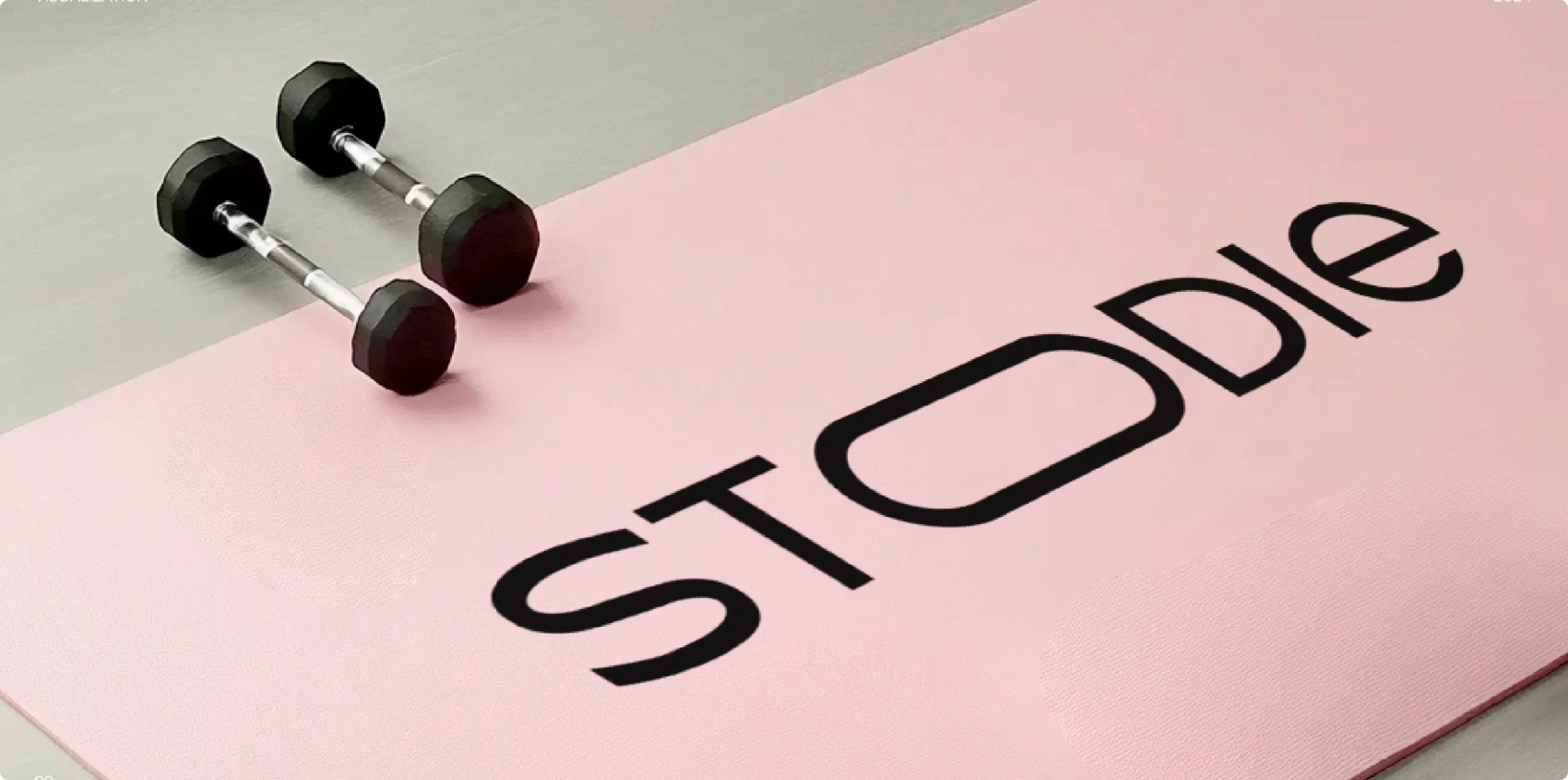
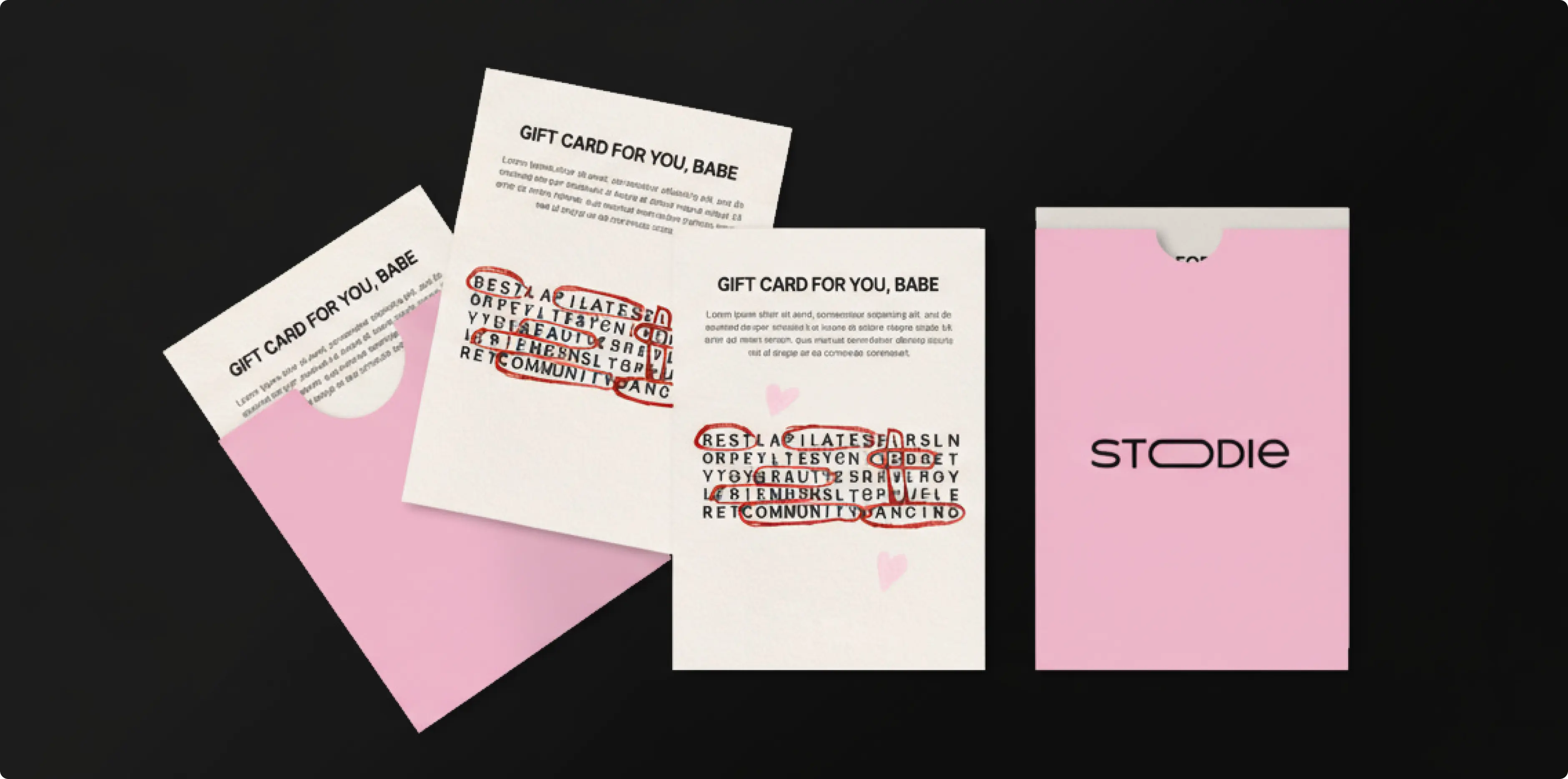
We made a vibrant, joyful pink the primary color, accenting it with black
and red. This created a fresh and unconventional palette for the fitness
niche, which is typically dominated by pastels and beige
We conveyed a sense of premium quality and boldness through typography
with strong, accent fonts
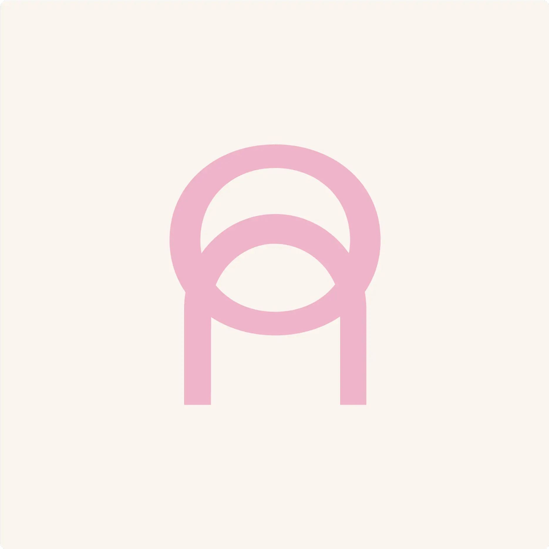
The sports code is integrated into the logo—a combination of a sports
equipment symbol and an arch, symbolizing openness and friendliness
We supported the overall aesthetic with Instagram content
marketing, actively using templates for posts, stories, and highlights
Challenges we faced
Standing out from numerous competitors in the fitness/
yoga niche
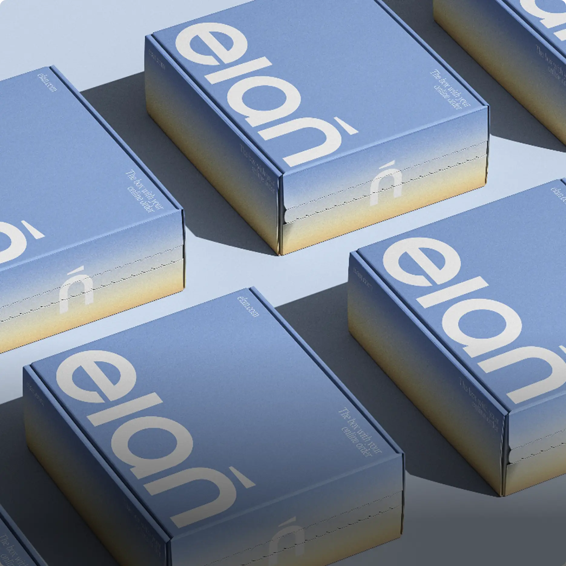
Ensuring the identity worked equally well in both digital
and physical formats (studio, merch, cards, certificates)
how we solved it

We bet on boldness and a fashion-forward aesthetic,
a deliberate departure from the typical look of yoga
brands
We developed a comprehensive visual systemthat works
seamlessly from social media to interior design and
packaging
We introduced a flexible logowith both a wordmark
and an iconic symbol, ensuring it looks sharp
and recognizable at any size, from a large storefront
to a small app icon
A fusion of sporty aesthetics and fashion-forward
graphics that allowed Stoodie to stand out from "typical"
yoga studios
A logo mark that functions as a standalone visual
asset in digital environments
A visual style inspired by"mat-side hangouts"
and a modern sense ofgirl power
Results
Stoodie received a vibrant and recognizable brand that:
Stands out in its niche and shatters the "yoga = calm beige" stereotype
Communicates its core values:sport + community + aesthetics
Adapts effortlessly across both digital and physical touchpoints
The client received more than just an identity—they got a complete
visual ecosystem, ready for launch and future growth