stoodie pilates&yoga studio

client
stoodie pilates&yoga studio
date
2024
services
strategy
branding
naming

stoodie pilates&yoga studio

client
stoodie pilates&yoga studio
date
2024
services
strategy
branding
naming
project overview
about

A new soft sports studio (yoga, Pilates, barre) that brings together women for training, socializing, and creative encounters

task

Develop an identity for a new chain of studios that:

differentiates itself from the traditional "zen/neutral" positioning of yoga;

presents the studio as a lifestyle and community space;

attracts a younger audience through the brand's aesthetics and values

how we did it

Big Idea
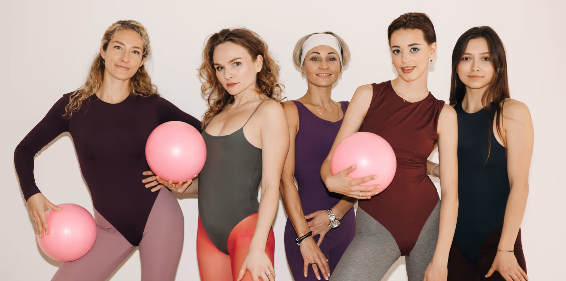
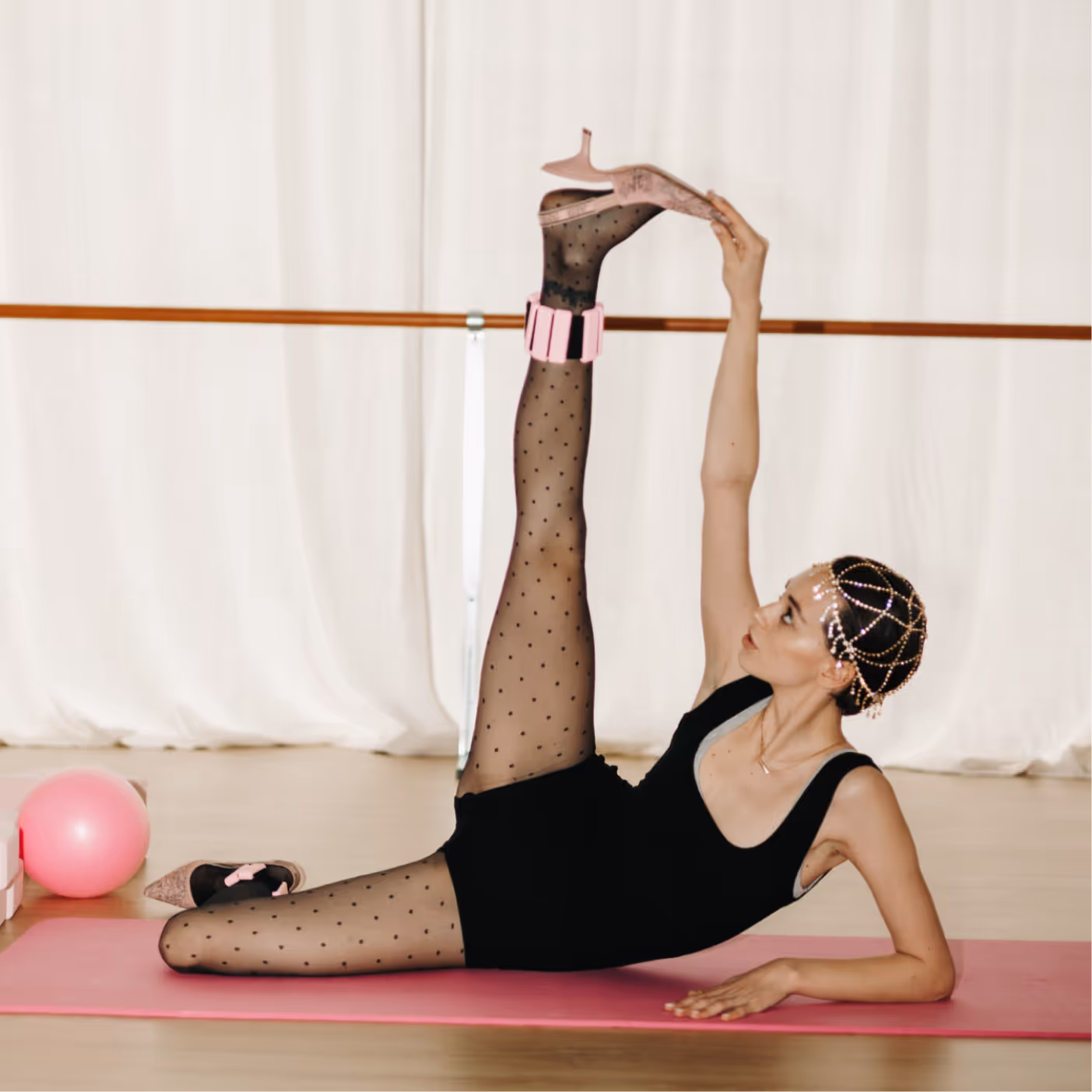
"Sport / Friends / You" — yoga and Pilates as part of modern life, not just sports, but community, friendship, and self-care
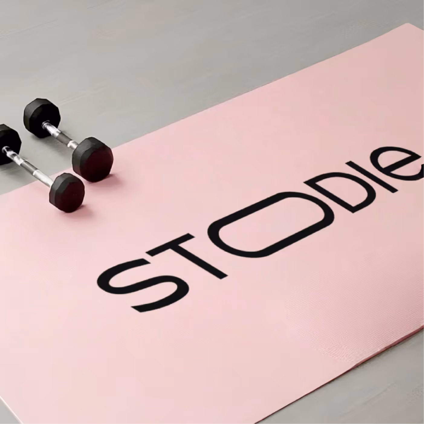
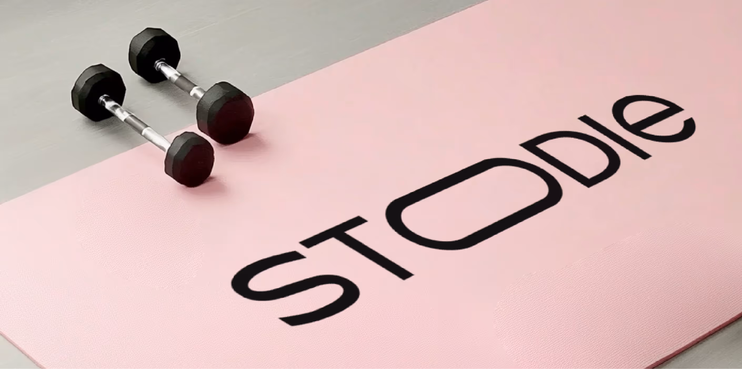
Colors
The main focus is on pink—bright, cheerful, symbolizing femininity, lightness, and a fun mood

Supported by black and red for balance and contrast

The result is a fresh and unconventional palette for the fitness niche, where pastels or beiges typically dominate

Typography
Baskerville (serif) for status and premium appeal

Inter Tight for legibility and versatility in digital

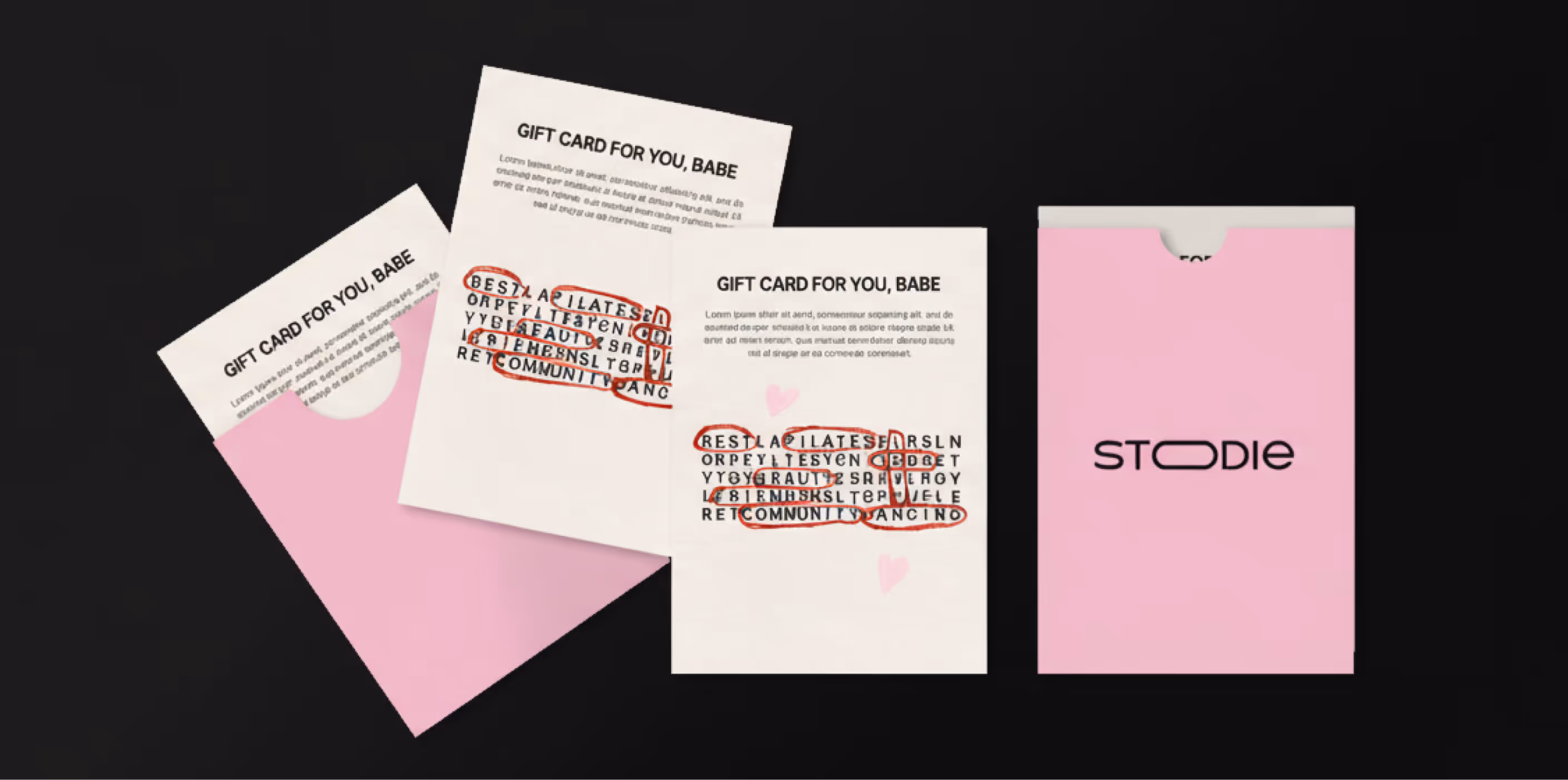
Accent handwritten font Pasta & Wine for playfulness and lightness
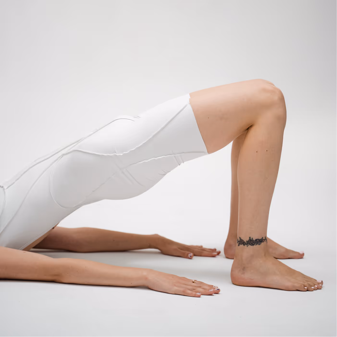
Visual LanguageA
combination of fashionable visuals and sporty codes

Active use of content marketing on Instagram: templates for posts, stories, and highlights

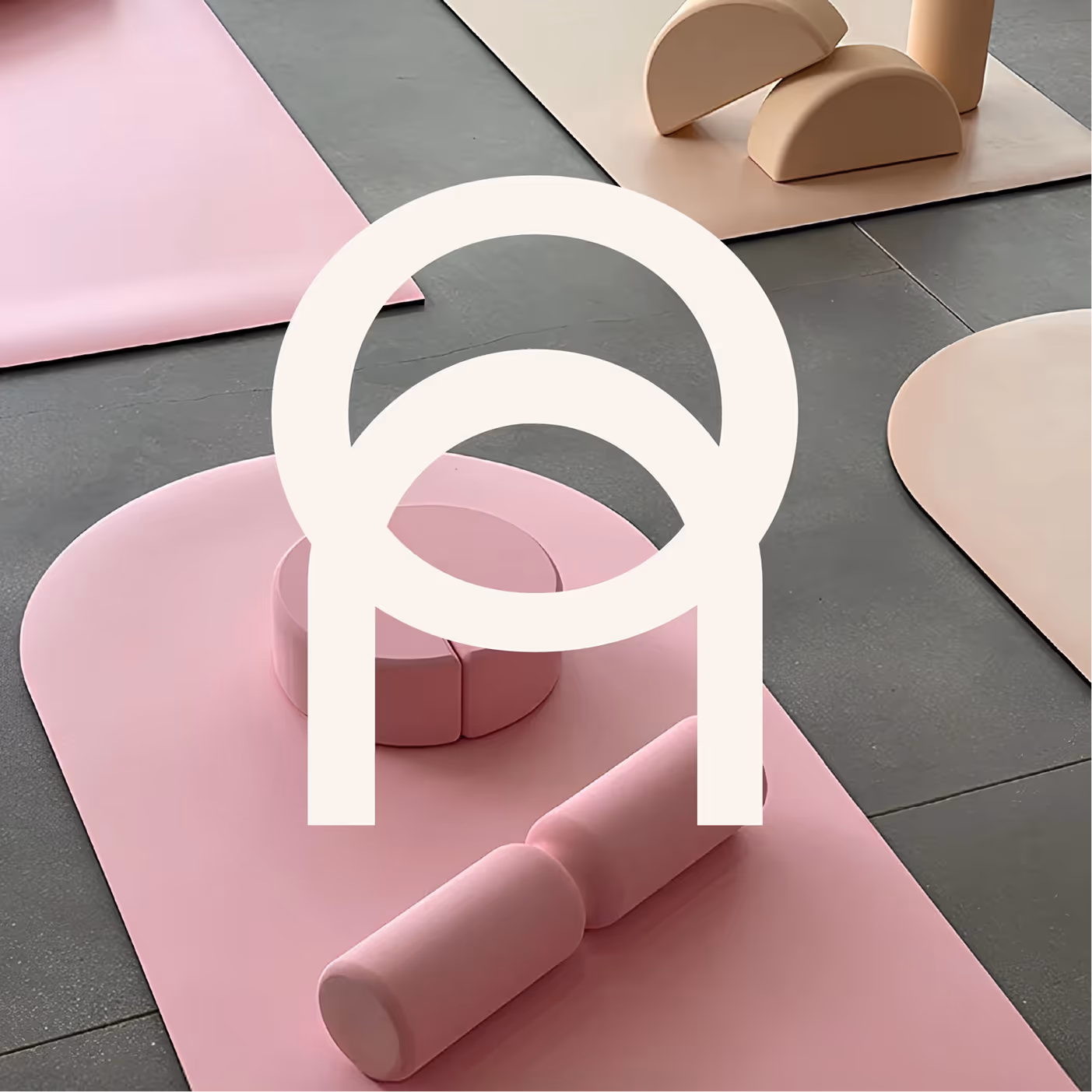
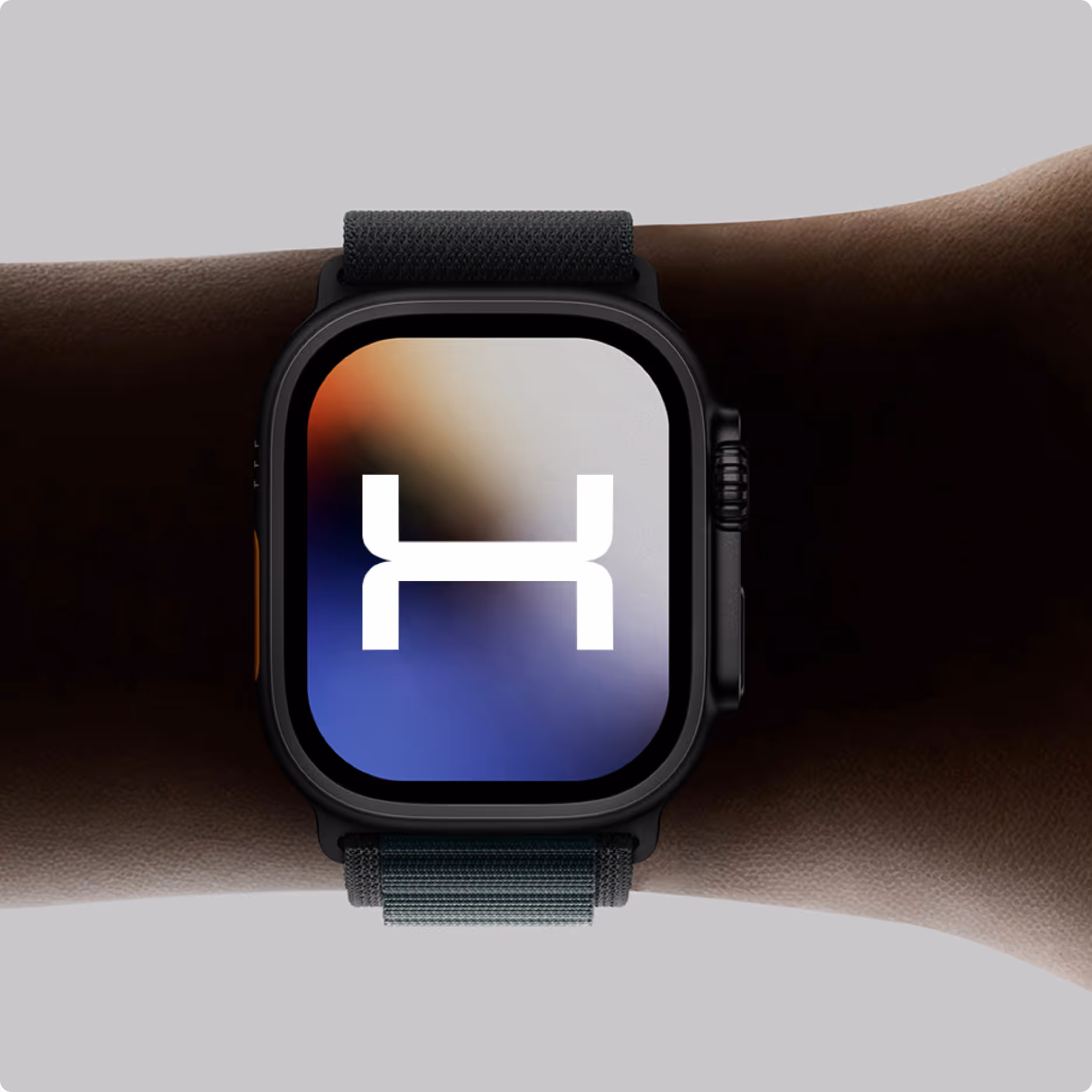
Logo + developed sign (a symbol of sports equipment and an arch as a metaphor for openness and friendliness)

Tone and MoodBold
confident, feminine, but not "sissy" – a balance of sexuality and strength

Communications are structured as a "girls' community," while the brand remains aesthetically pleasing and fashion-inspired

Difficulties

We needed to differentiate ourselves from the many competitors in the fitness/yoga niche

We needed to create an identity that would work both digitally and offline (studio, merch, cards, certificates)

How We Decided

we focused on a vibrant and fashionable style, which is not typical for yoga brands

We developed a visual system—from social media to interior design and packaging

We added flexibility to the logo: text and an iconic symbol—to ensure it would look equally good in large and small formats

Unusual finds

A blend of sports aesthetics and fashion graphics allows STOODIE to stand out from the crowd of "typical" studios

A logotype that can be used as a standalone visual element in digital media

A visual presentation inspired by "mock parties" and modern girl power

result

STOODIE received a vibrant and recognizable brand that:

stands out in its niche and breaks the stereotype of "yoga = calm beige";

communicates values: sport + community + aesthetics;

easily adapts to digital and offline media

​​The client received not only an identity but also a ready-made ecosystem of visual solutions for launch and promotion

get in touch

Leave your details and we will contact you shortly to discuss the project

Thank you! Your submission has been received!
Oops! Something went wrong while submitting the form.

WE CREATE STRONG BRANDS AND MAKE THEM STAND OUT IN THE DIGITAL WORLD

New york [01:40 PM]

Warsaw [07:40 PM]

© 2025 Fands agency. all rights reserved

privacy policy

© 2025 Fands agency. all rights reserved

privacy policy