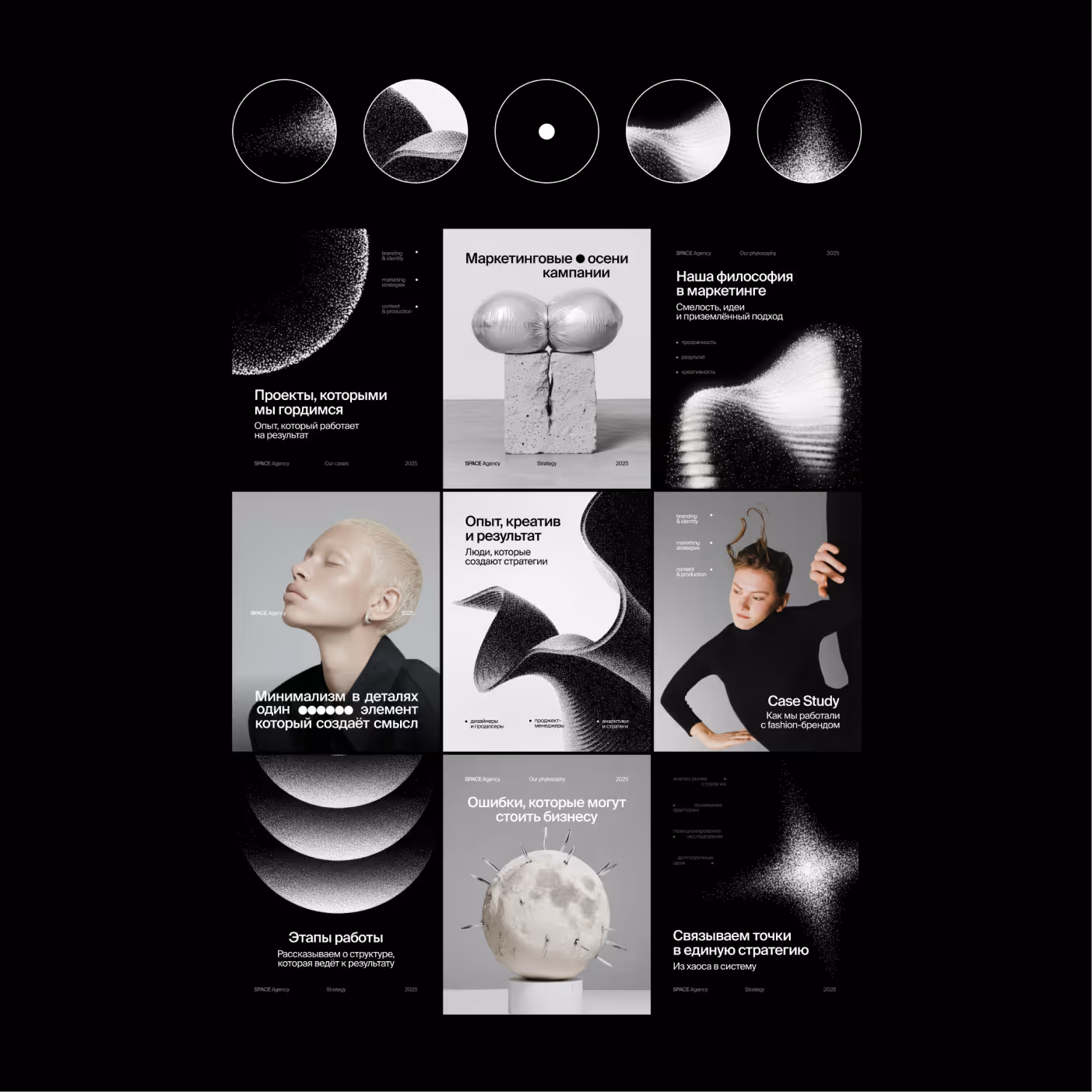
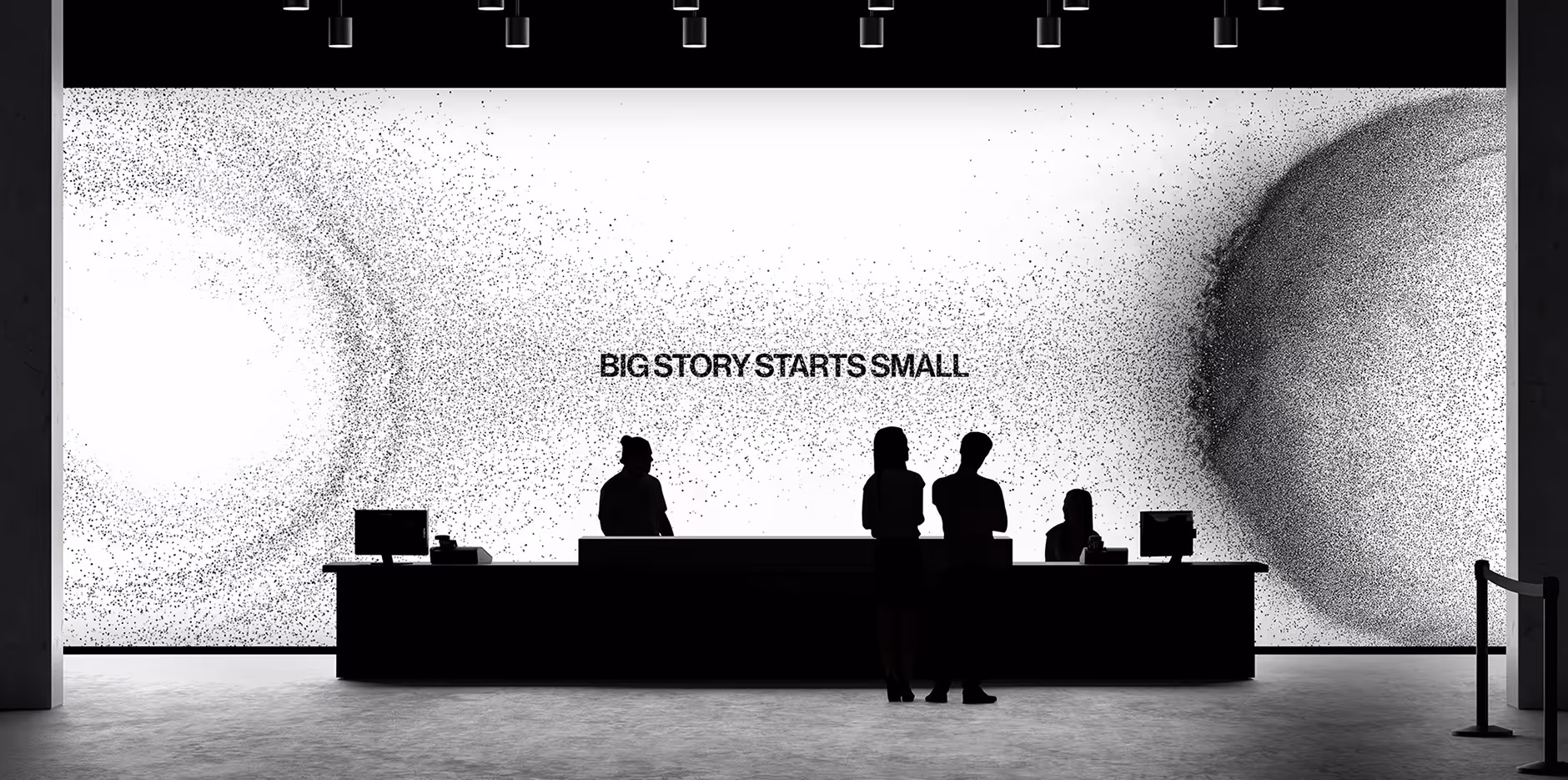
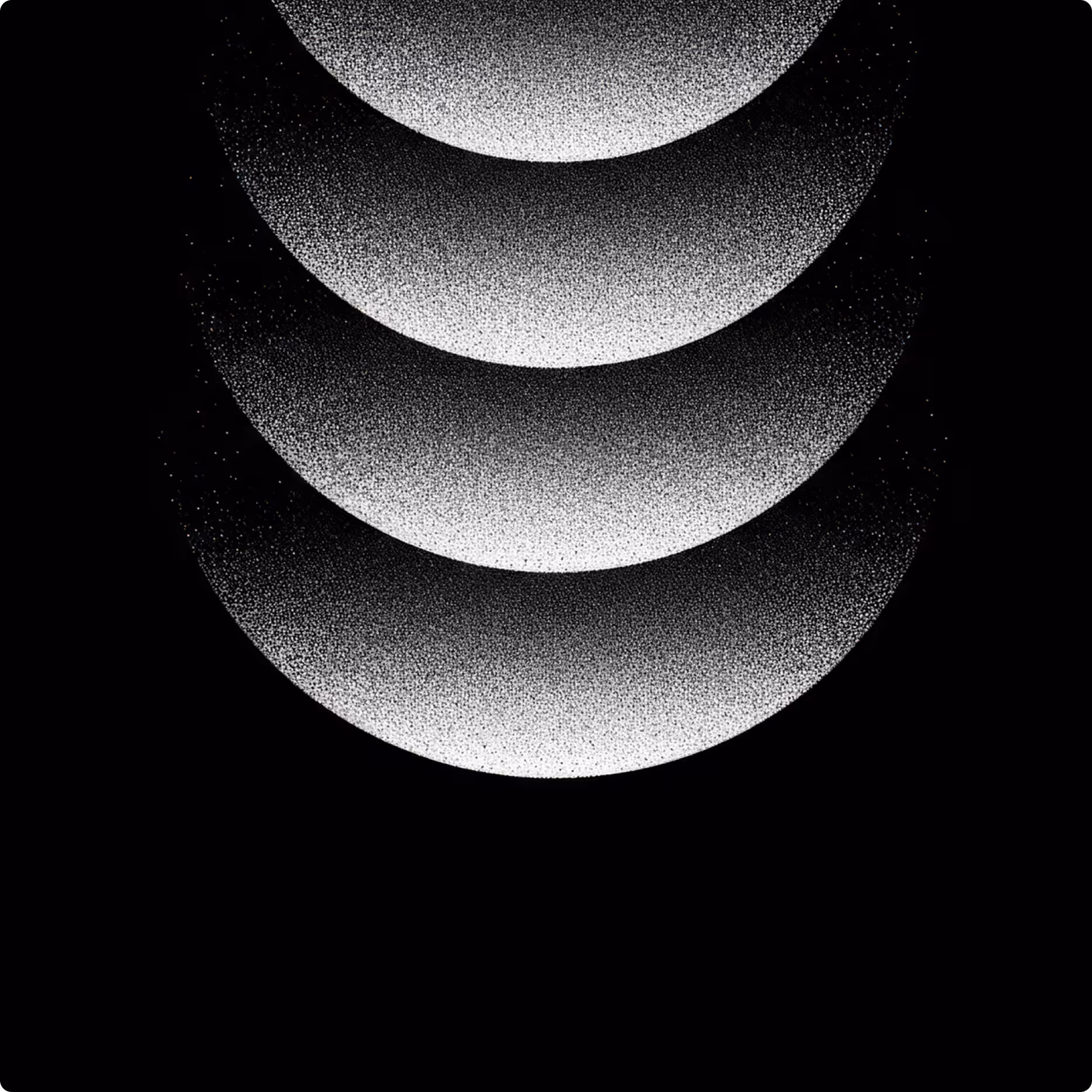
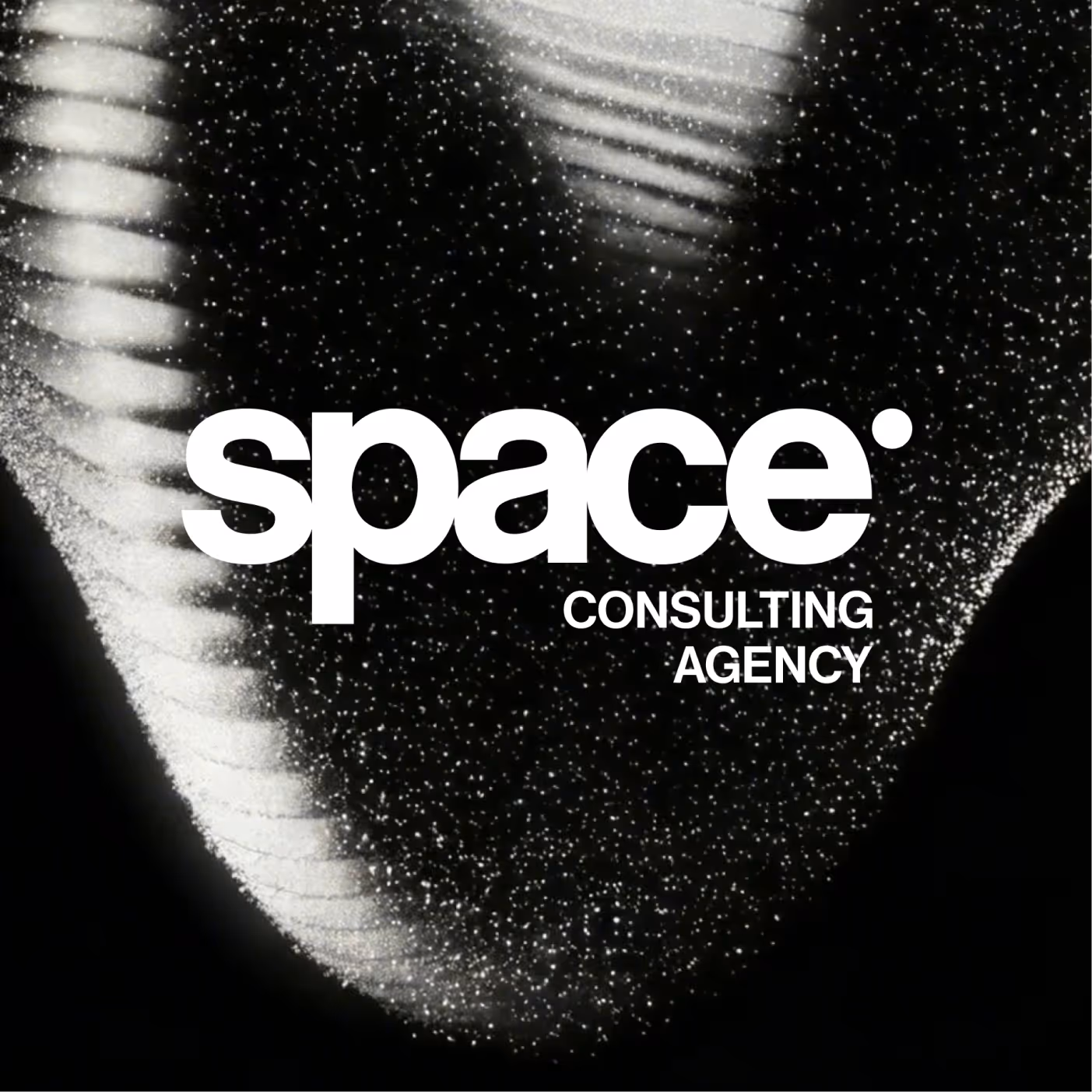
space consulting

client
space consulting
date
may-june 2024
services
branding

space consulting

client
space consulting
date
may-june 2024
services
branding
project overview
about

a consulting agency that needed to stand out from its many long-standing competitors while maintaining its unique DNA

task

Develop an identity that highlights the company's uniqueness and expertise

Distinguish the agency from strong competitors

Preserve and reflect the brand's DNA and values

how we did it

The concept is based on the idea of ​​space, quasars, and the dot as a symbol of the beginning of a new journey. Space is not depicted head-on, but through accents: geometry, textures, and shapes

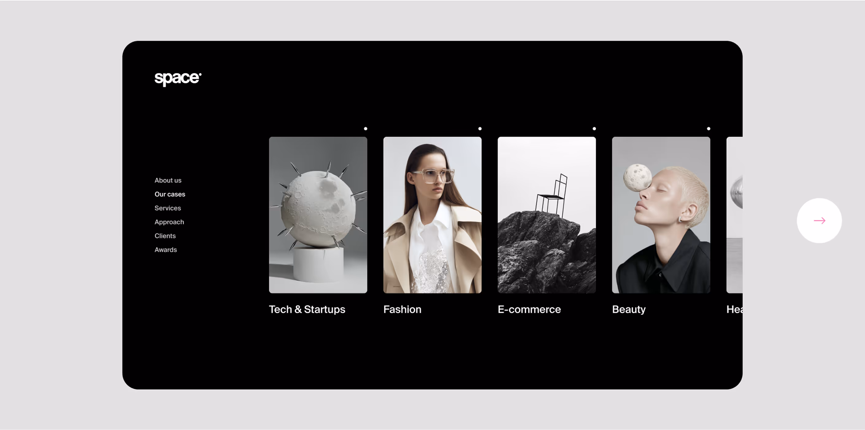
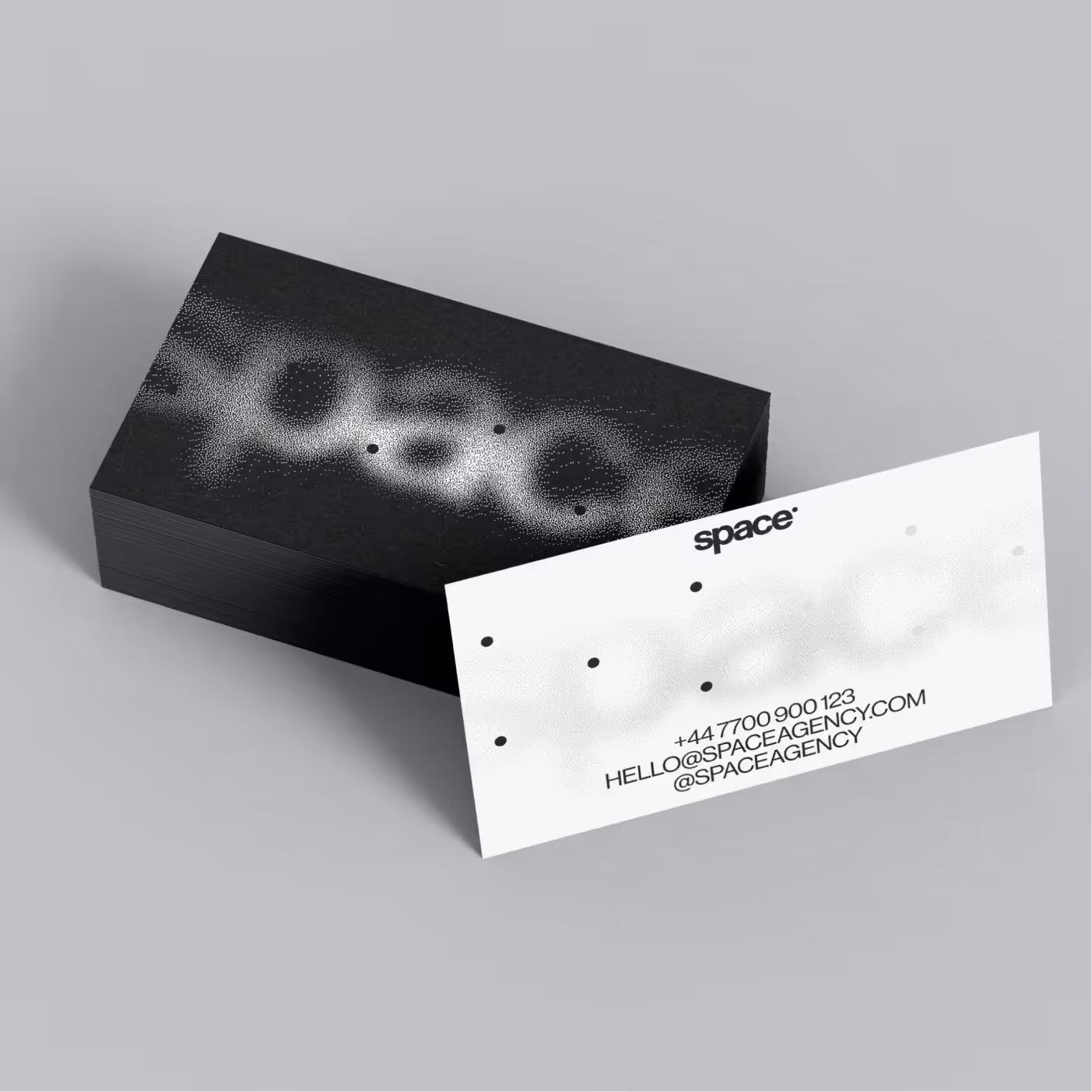
The logo is minimalist: a laconic Neue Haas Grotesk font and a dot symbol, acting as a sign of initiation, focus, and energy

The color palette is black and white with accents of gray and silver: Cloud Whisper, Urban Mist, Fogged Silver, and Midnight Orbit. It creates a technological and premium atmosphere without being overly austere

Visual elements include stardust textures and abstract galactic and orbital shapes, which help build a brand language without overloading "cosmic" symbolism

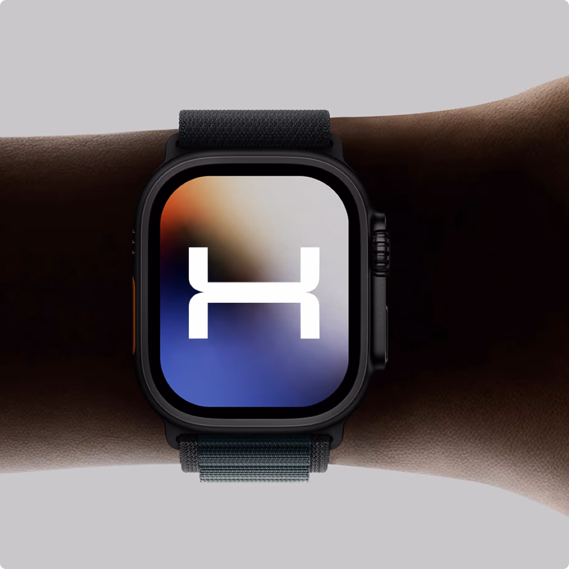
Merch and media (business cards, hoodies, travel kits, beauty kits, stickers, digital communications) emphasize the brand's integrity and make it recognizable

Difficulties

We needed to create a strong and distinctive style in a category filled with similar players. it was important to avoid direct associations with "astronomy" and find a metaphorical language of space that would work in both digital and print media

How We Decided

We focused on the dot as a key element unifying all visual media

We used stardust and cosmic texture only as accents to give the brand a modern and sophisticated look, rather than a cluttered one

Unusual finds

The branded point has become an independent symbol, working in both digital and offline media

The use of space through geometry and minimalism, rather than through illustrative solutions

Rethinking the category: the agency has not joined the competition, but has formed its own visual orbit

result

The result is a strong, modern brand that conveys the company's expertise and uniqueness

The visual system is easily scalable: from digital and presentations to merchandise and packaging

The client received an identity that distinguishes them in the market while reflecting the company's philosophy

get in touch

Leave your details and we will contact you shortly to discuss the project

Thank you! Your submission has been received!
Oops! Something went wrong while submitting the form.

WE CREATE STRONG BRANDS AND MAKE THEM STAND OUT IN THE DIGITAL WORLD

New york [01:40 PM]

Warsaw [07:40 PM]

© 2025 Fands agency. all rights reserved

privacy policy

© 2025 Fands agency. all rights reserved

privacy policy