

how we did it
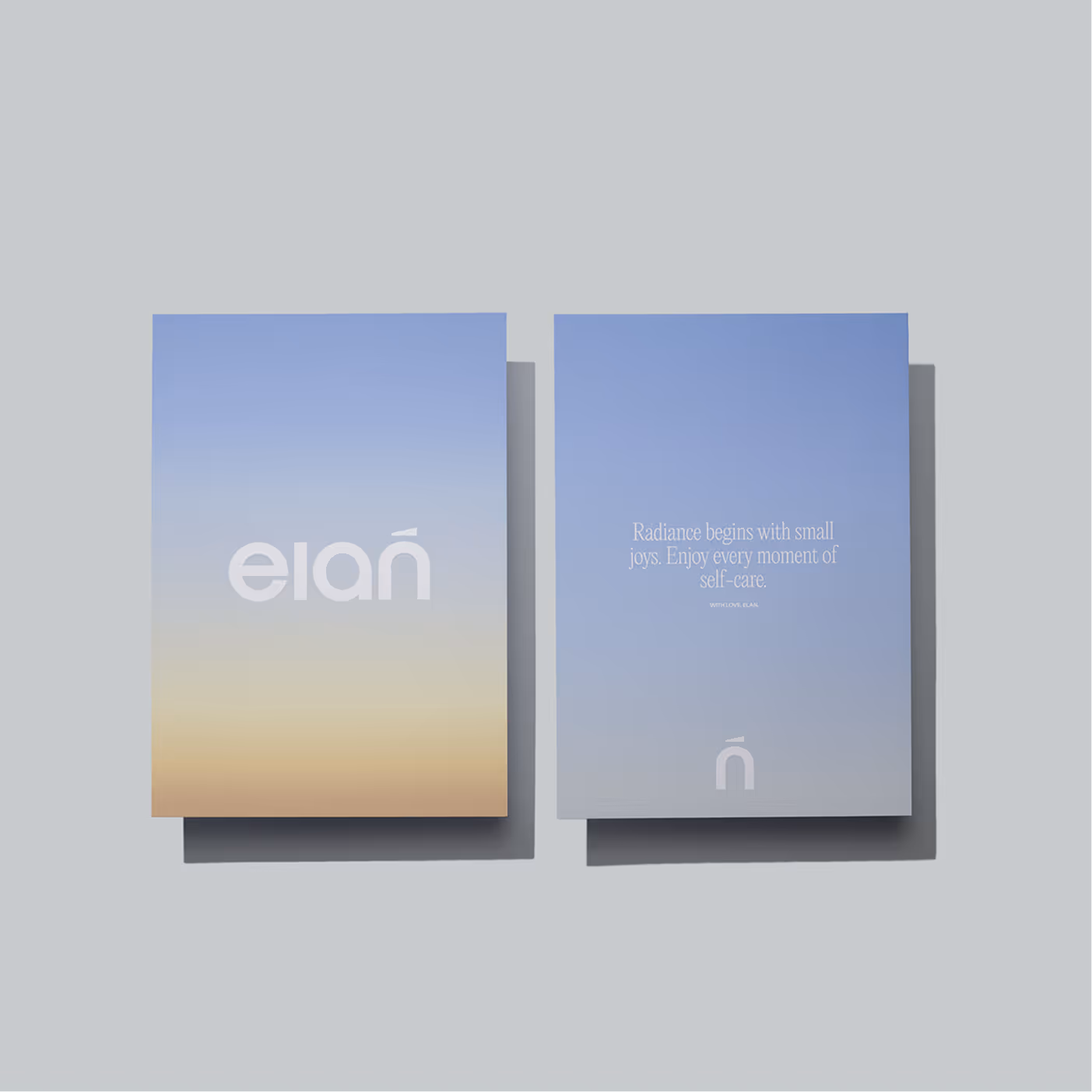
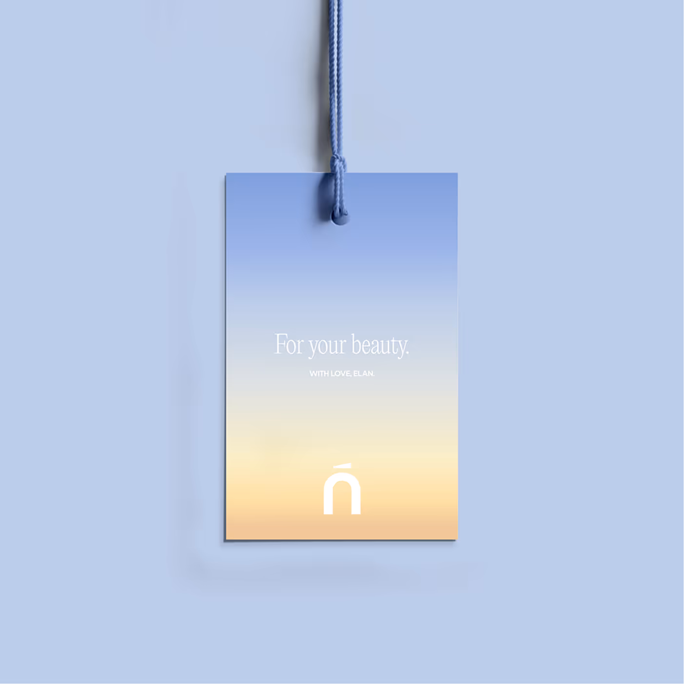
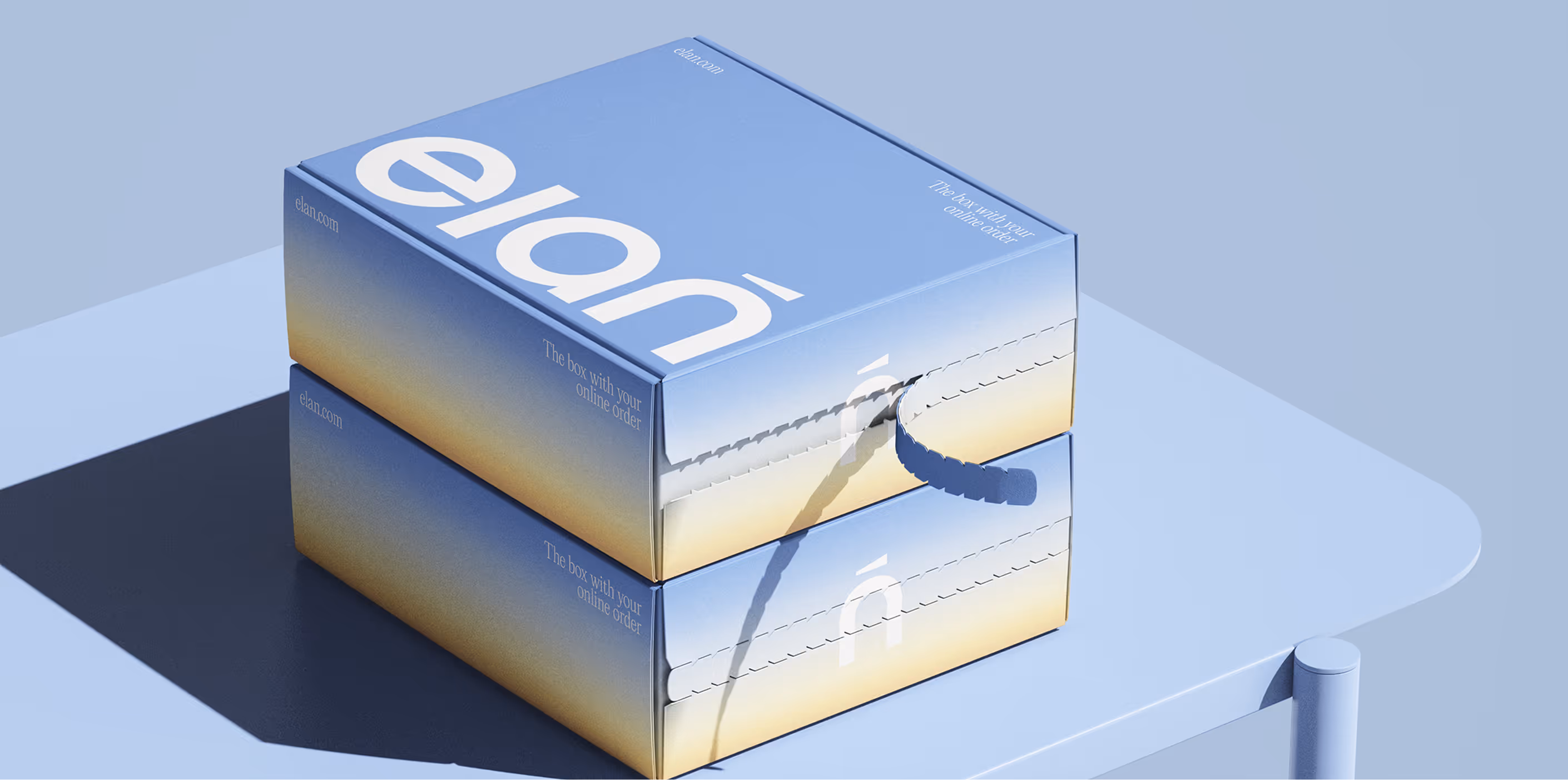
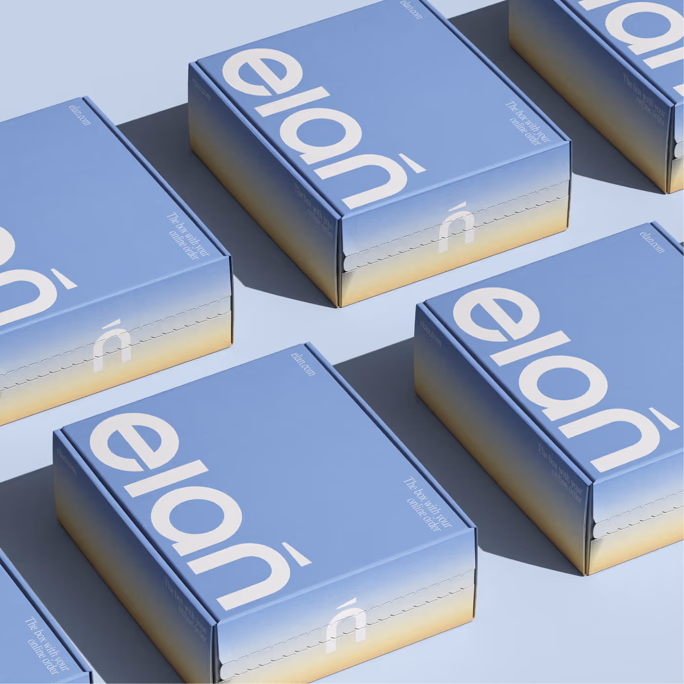
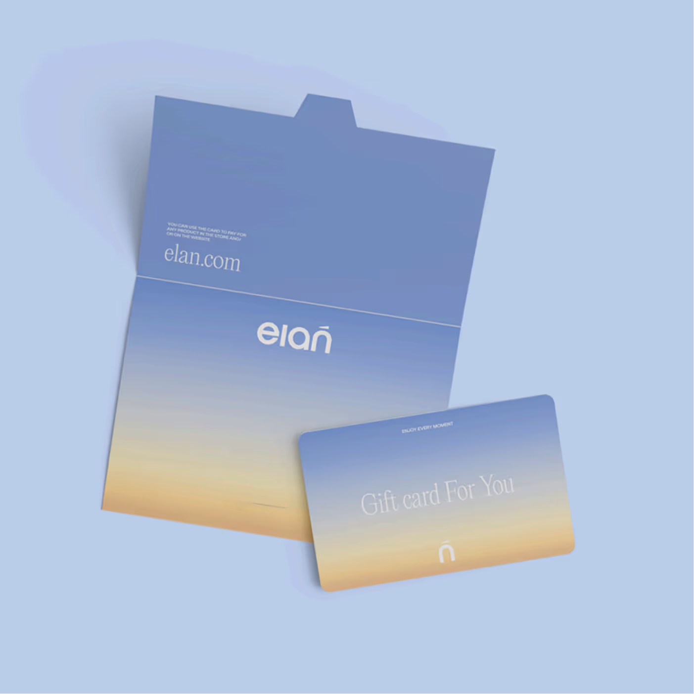
We focused on a combination of elegance and accessibility to reach a broad Middle Eastern audience. We chose azure blue and sunny yellow as the brand's primary colors:
Blue symbolizes purity, transparency, and trust, and is also associated with the sky and water—important symbols of spirituality in the region
Yellow conveys energy, joy, and life, echoing the sun and gold—traditional symbols of strength and abundance in the East
Together, they form a balanced, gender-neutral combination that appeals to both men and women
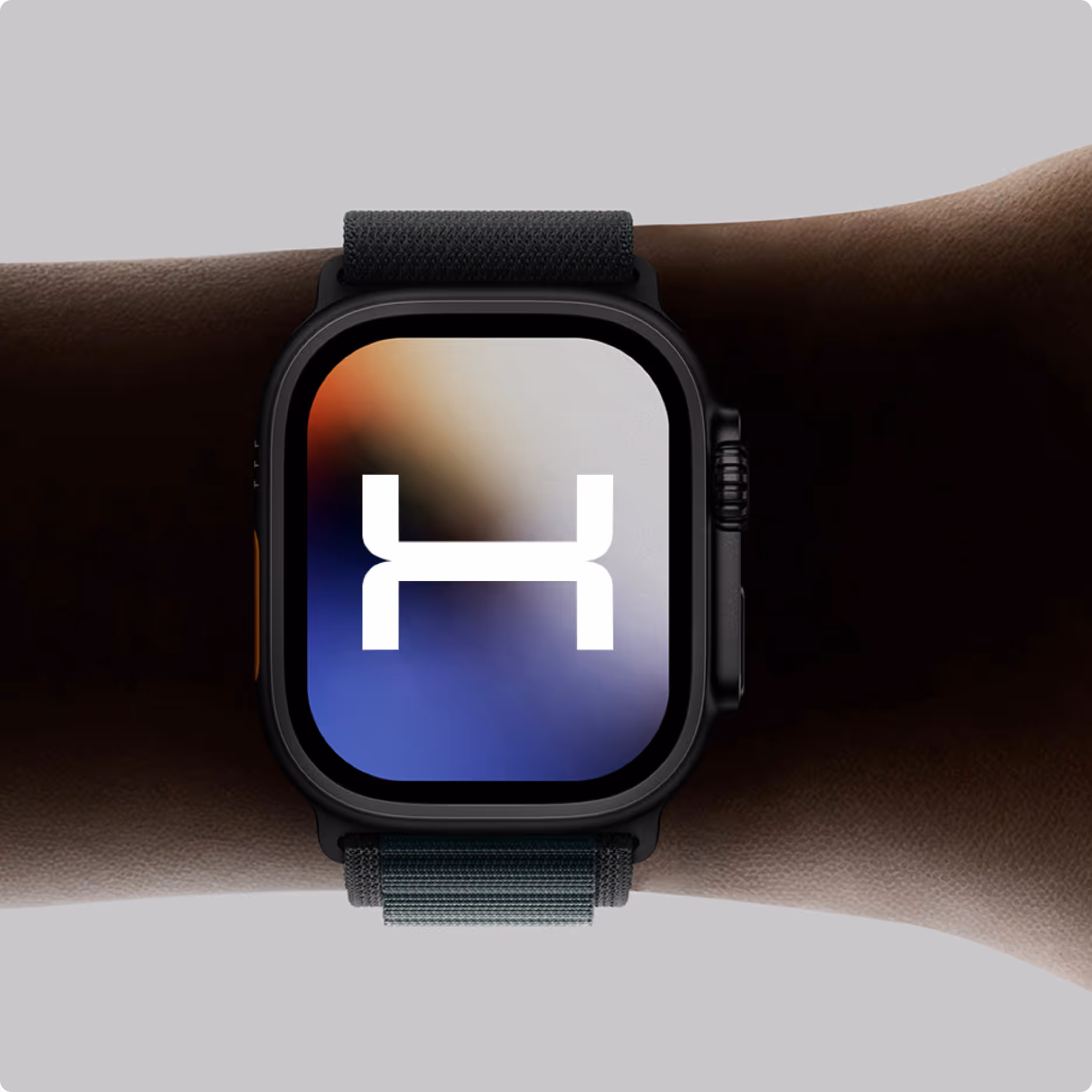
Typography
Minimalistic, gender-neutral
Rounded shapes create a friendly atmosphere, while clear geometry adds professionalism and premium appeal
This references the brand's expertise, created by doctors and skincare specialists