Stoodie
About the project:
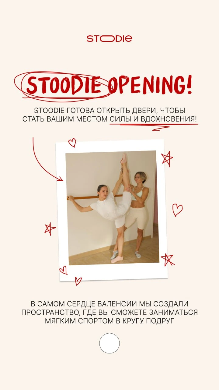
A new Pilates and yoga studio in sunny Valencia. Before the launch, the client approached FANDS for naming and branding to stand out in the market from day one and become a go-to spot for Instagram-savvy audiences.
completed


how We Did it:
Stoodie - it's a light, vibrant but still soft name, that reflects the studio's positioning: a place for comfortable workouts and building a new community.
The double ‘O’ symbolizes so much: fitness balls, your shape after workouts, and curious, wide-open eyes ready to meet new friends on the next yoga mat. Double ‘O’ magic!
We also captured the soul of the project through branding: the logo, certificates, and other brand materials. We created a unique logo, 80% handcrafted by the project’s designers.
It’s built from different fonts — an intentional choice to represent the diversity of the Stoodie community. Women from all walks of life come to the studio, and each one is truly unique.
Result:
A couple of details:
— The shortened letter spacing symbolizes the closeness of the community.
— The oval, elongated "O" represents the workout mat and visually hints at the correct double pronunciation of ‘U’.
— The flexible, soft lines symbolize movement and the curves of the female body.
We created a brand that inspires movement and being part of something bigger. Ready to reimagine your brand too? Let’s do it.
our cases


